


Introduction to Regression with statsmodels in Python
Linear regression and logistic regression are two of the most widely used statistical models. They act like master keys, unlocking the secrets hidden in your data. Updating ...
Linear regression and logistic regression are two of the most widely used statistical models. They act like master keys, unlocking the secrets hidden in your data. In this course, you’ll gain the skills you need to fit simple linear and logistic regressions. Through hands-on exercises, you’ll explore the relationships between variables in real-world datasets, including motor insurance claims, Taiwan house prices, fish sizes, and more. By the end of this course, you’ll know how to make predictions from your data, quantify model performance, and diagnose problems with model fit.
import pandas as pd
import numpy as np
import warnings
import matplotlib.pyplot as plt
import seaborn as sns
from statsmodels.formula.api import ols

plt.rcParams['figure.figsize'] = [10, 7.5]

pd.set_option('display.expand_frame_repr', False)

warnings.filterwarnings("ignore")
You’ll learn the basics of this popular statistical model, what regression is, and how linear and logistic regressions differ. You’ll then learn how to fit simple linear regression models with numeric and categorical explanatory variables, and how to describe the relationship between the response and explanatory variables using model coefficients.
Jargon:
- Response variable (a.k.a. dependent variable)
- The variable that you want to predict.
- Explanatory variables (a.k.a. independent variables)
- The variables that explain how the response variable will change.
- The variables that explain how the response variable will change.
- Response variable (a.k.a. dependent variable)
Linear regression and logistic regression:
- Linear regression
- The response variable is numeric.
- Logistic regression
- The response variable is logical.
- Simple linear/logistic regression
- There is only one explanatory variable.
- There is only one explanatory variable.
- Linear regression
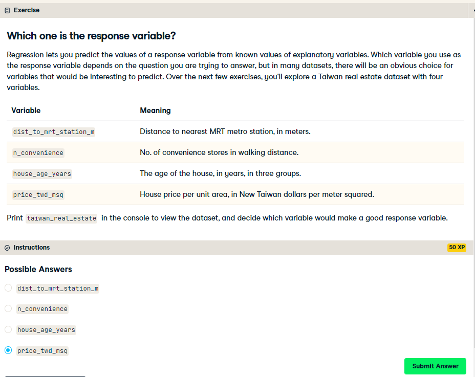
Which one is the response variable?
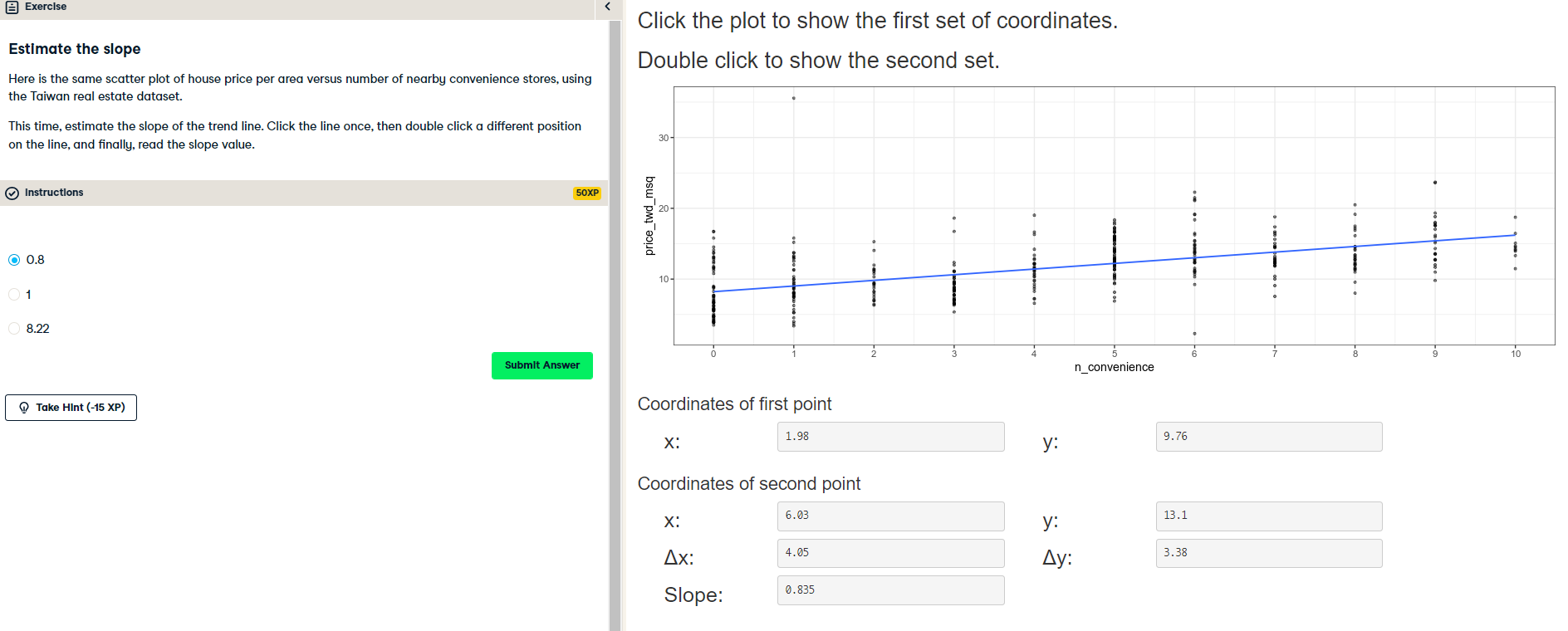
Visualizing two numeric variables
Before you can run any statistical models, it's usually a good idea to visualize your dataset. Here, you'll look at the relationship between house price per area and the number of nearby convenience stores using the Taiwan real estate dataset.
One challenge in this dataset is that the number of convenience stores contains integer data, causing points to overlap. To solve this, you will make the points transparent.
taiwan_real_estate is available as a pandas DataFrame.
Instructions:
- Import the seaborn package, aliased as
sns. - Using
taiwan_real_estate, draw a scatter plot of "price_twd_msq" (y-axis) versus "n_convenience" (x-axis). - Draw a trend line calculated using linear regression. Omit the confidence interval ribbon. Note: The scatter_kws argument, pre-filled in the exercise, makes the data points 50% transparent.
taiwan_real_estate = pd.read_csv('./datasets/taiwan_real_estate2.csv')
display(taiwan_real_estate.head())
display(taiwan_real_estate.info())
import seaborn as sns

# Import matplotlib.pyplot with alias plt
import matplotlib.pyplot as plt

# Draw the scatter plot
sns.scatterplot(x="n_convenience",
                y="price_twd_msq",
                data=taiwan_real_estate)

# Draw a trend line on the scatter plot of price_twd_msq vs. n_convenience
sns.regplot(x="n_convenience",
            y="price_twd_msq",
            data=taiwan_real_estate,
            ci=None,
            scatter_kws={'alpha': 0.5},
            line_kws={"color": "red"})

# Show the plot
plt.show()

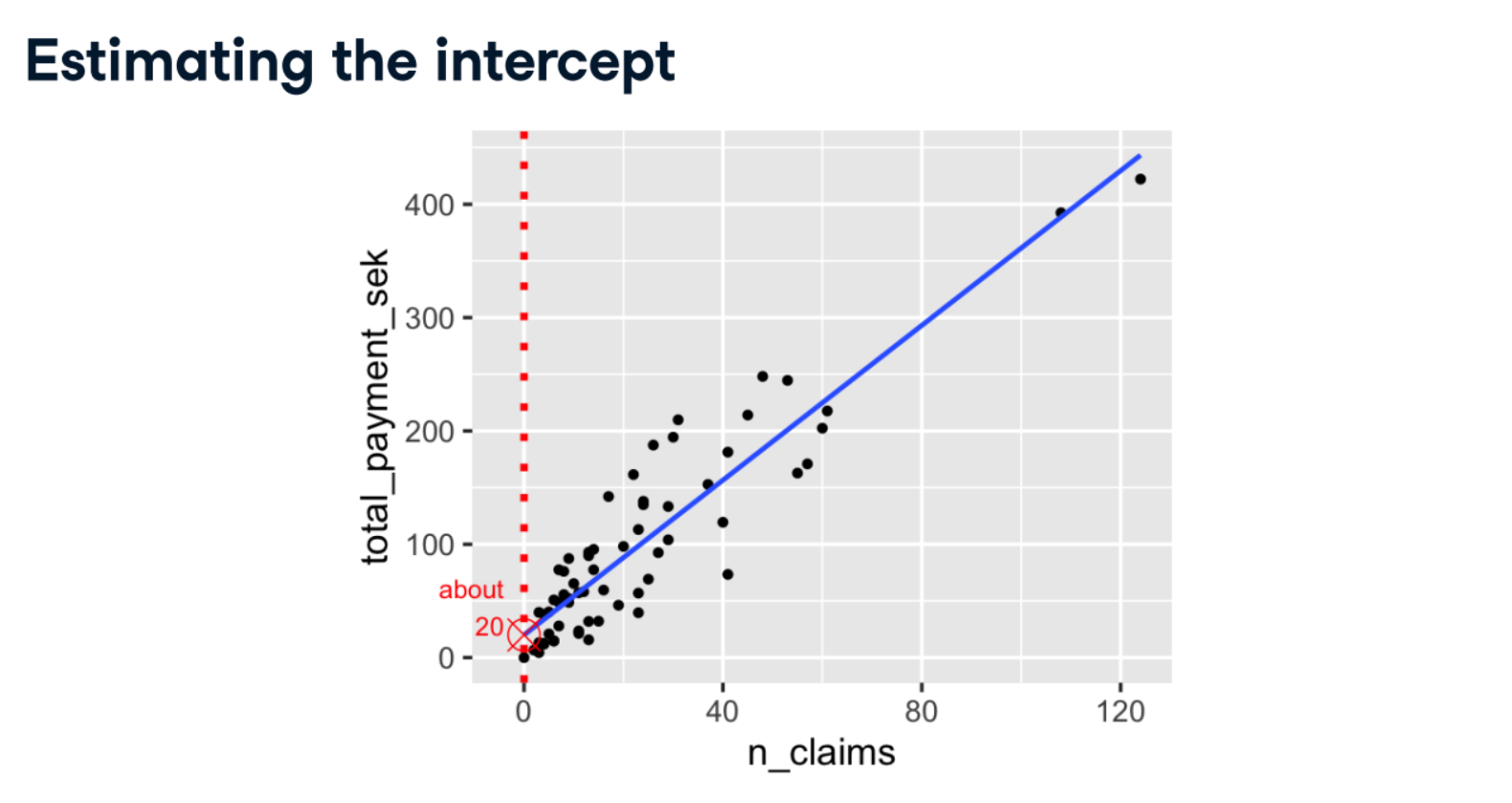
Estimate the intercept

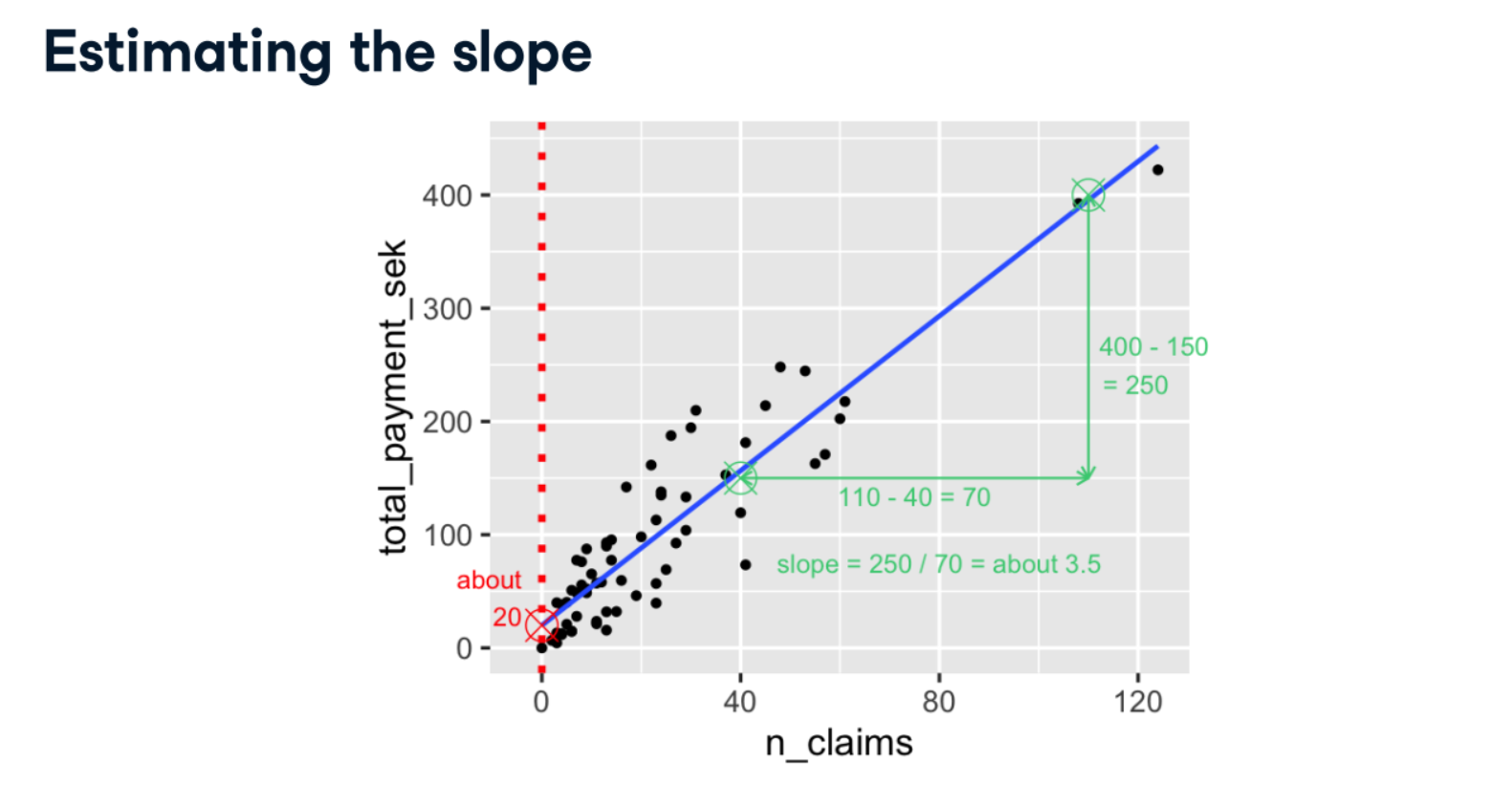
Estimate the slope
Linear regression with ols()
While sns.regplot() can display a linear regression trend line, it doesn't give you access to the intercept and slope as variables, or allow you to work with the model results as variables. That means that sometimes you'll need to run a linear regression yourself.
Time to run your first model!
taiwan_real_estate is available. TWD is an abbreviation for Taiwan dollars.
In addition, for this exercise and the remainder of the course, the following packages will be imported and aliased if necessary:matplotlib.pyplot as plt, seaborn as sns, and pandas as pd.
Instructions:
- Import the ols() function from the statsmodels.formula.api package.
- Run a linear regression with price_twd_msq as the response variable, n_convenience as the explanatory variable, and taiwan_real_estate as the dataset. Name it mdl_price_vs_conv.
- Fit the model.
- Print the parameters of the fitted model.
# Import the ols function
from statsmodels.formula.api import ols

# Create the model object
mdl_price_vs_conv = ols("price_twd_msq ~ n_convenience", data=taiwan_real_estate)

# Fit the model
mdl_price_vs_conv = mdl_price_vs_conv.fit()

# Print the parameters of the fitted model
print(mdl_price_vs_conv.params)
Question: The model had an Intercept coefficient of 8.2242. What does this mean?
Possible Answers:
On average, houses had a price of 8.2242 TWD per square meter.
On average, a house with zero convenience stores nearby had a price of 8.2242 TWD per square meter.
The minimum house price was 8.2242 TWD per square meter.
The minimum house price with zero convenience stores nearby was 8.2242 TWD per square meter.
The intercept tells you nothing about house prices.
Question: The model had an n_convenience coefficient of 0.7981. What does this mean?
Possible Answers:
If you increase the number of nearby convenience stores by one, then the expected increase in house price is 0.7981 TWD per square meter.
If you increase the house price by 0.7981 TWD per square meter, then the expected increase in the number of nearby convenience stores is one.
If you increase the number of nearby convenience stores by 0.7981, then the expected increase in house price is one TWD per square meter.
If you increase the house price by one TWD per square meter, then the expected increase in the number of nearby convenience stores is 0.7981.
The n_convenience coefficient tells you nothing about house prices.
The intercept is positive, so a house with no convenience stores nearby still has a positive price. The coefficient for convenience stores is also positive, so as the number of nearby convenience stores increases, so does the price of the house.
Fish dataset:
- Each row represents one fish.
- There are 128 rows in the dataset.
- There are 4 species of fish:
- Common Bream
- European Perch
- Northern Pike
- Common Roach
import matplotlib.pyplot as plt
import seaborn as sns

fish = pd.read_csv("./datasets/fish.csv")
sns.displot(data=fish,
            x="mass_g",
            col="species",
            col_wrap=2,
            bins=9)
plt.show()

summary_stats = fish.groupby("species")["mass_g"].mean()
print(summary_stats)
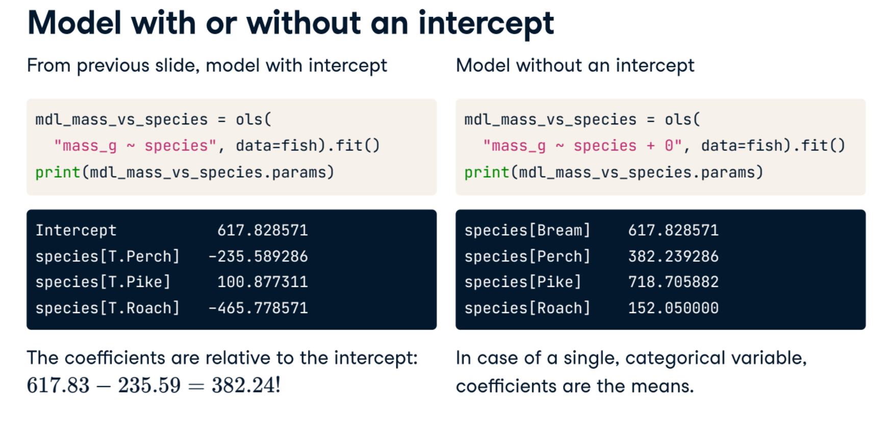
from statsmodels.formula.api import ols
mdl_mass_vs_species = ols("mass_g ~ species", data=fish).fit()
print(mdl_mass_vs_species.params)
Visualizing numeric vs. categorical
If the explanatory variable is categorical, the scatter plot that you used before to visualize the data doesn't make sense. Instead, a good option is to draw a histogram for each category.
The Taiwan real estate dataset has a categorical variable in the form of the age of each house. The ages have been split into 3 groups:0 to 15 years, 15 to 30 years, and 30 to 45 years.
Instructions:
- Using taiwan_real_estate, plot a histogram of price_twd_msq with 10 bins. Split the plot by house_age_years to give 3 panels.
plt.rcParams['figure.figsize'] = [10, 10]
sns.displot(data=taiwan_real_estate,
         x="price_twd_msq",
         col="house_age_years",
         bins=10)

# Show the plot
plt.show()

Calculating means by category
A good way to explore categorical variables further is to calculate summary statistics for each category. For example, you can calculate the mean and median of your response variable, grouped by a categorical variable. As such, you can compare each category in more detail.
Here, you'll look at grouped means for the house prices in the Taiwan real estate dataset. This will help you understand the output of a linear regression with a categorical variable.
mean_price_by_age = taiwan_real_estate.groupby("house_age_years")["price_twd_msq"].mean()

# Print the result
print(mean_price_by_age)
Linear regression with a categorical explanatory variable
Great job calculating those grouped means! As mentioned in the last video, the means of each category will also be the coefficients of a linear regression model with one categorical variable. You'll prove that in this exercise.
To run a linear regression model with categorical explanatory variables, you can use the same code as with numeric explanatory variables. The coefficients returned by the model are different, however. Here you'll run a linear regression on the Taiwan real estate dataset.
mdl_price_vs_age = ols("price_twd_msq ~ house_age_years", data=taiwan_real_estate).fit()

# Print the parameters of the fitted model
print(mdl_price_vs_age.params)
mdl_price_vs_age0 = ols("price_twd_msq ~ house_age_years + 0", data=taiwan_real_estate).fit()

# Print the parameters of the fitted model
print(mdl_price_vs_age0.params)
The coefficients of the model are just the means of each category you calculated previously.
Predictions and model objects
In this chapter, you’ll discover how to use linear regression models to make predictions on Taiwanese house prices and Facebook advert clicks. You’ll also grow your regression skills as you get hands-on with model objects, understand the concept of "regression to the mean", and learn how to transform variables in a dataset.
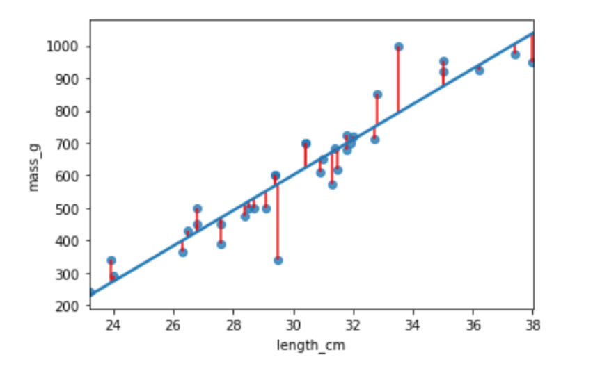
bream = fish[fish["species"] == "Bream"]
print(bream.head())
plt.rcParams['figure.figsize'] = [7.5, 5]
sns.regplot(x="length_cm",
            y="mass_g",
            data=bream,
            ci=None)
plt.show()

mdl_mass_vs_length = ols("mass_g ~ length_cm", data=bream).fit()
print(mdl_mass_vs_length.params)
# what value would the response variable have?
explanatory_data = pd.DataFrame({"length_cm": np.arange(20, 41)})
explanatory_data[:5]
display(mdl_mass_vs_length.predict(explanatory_data)[:5])
explanatory_data = pd.DataFrame( {"length_cm": np.arange(20, 41)} )

# create new df with new mass_g col from the above df
prediction_data = explanatory_data.assign( mass_g=mdl_mass_vs_length.predict(explanatory_data))
display(prediction_data.head())
import matplotlib.pyplot as plt
import seaborn as sns

fig = plt.figure()

sns.regplot(x="length_cm",
            y="mass_g",
            ci=None,
            data=bream,)

sns.scatterplot(x="length_cm",
                y="mass_g",
                data=prediction_data,
                color="red",
                marker="s")
plt.show()

# outside the range of observed data.
little_bream = pd.DataFrame({"length_cm": [10]})
pred_little_bream = little_bream.assign(
mass_g=mdl_mass_vs_length.predict(little_bream))
print(pred_little_bream)
sns.regplot(x="length_cm",
            y="mass_g",
            ci=None,
            data=bream,)

sns.scatterplot(x="length_cm",
                y="mass_g",
                data=pred_little_bream,
                color="red",
                marker="s")
plt.show()

Predicting house prices
Perhaps the most useful feature of statistical models like linear regression is that you can make predictions. That is, you specify values for each of the explanatory variables, feed them to the model, and get a prediction for the corresponding response variable. The code flow is as follows.
explanatory_data = pd.DataFrame({"explanatory_var":list_of_values})predictions = model.predict(explanatory_data)
prediction_data = explanatory_data.assign(response_var=predictions)
Here, you'll make predictions for the house prices in the Taiwan real estate dataset.
taiwan_real_estate is available. The fitted linear regression model of house price versus number of convenience stores is available as mdl_price_vs_conv. For future exercises, when a model is available, it will also be fitted.
import numpy as np

# Create explanatory_data
explanatory_data = pd.DataFrame({'n_convenience': np.arange(0, 11)})

# Use mdl_price_vs_conv to predict with explanatory_data, call it price_twd_msq
price_twd_msq = mdl_price_vs_conv.predict(explanatory_data)

# Create prediction_data
prediction_data = explanatory_data.assign(
    price_twd_msq = price_twd_msq)

# Print the result
display(prediction_data)
Visualizing predictions
The prediction DataFrame you created contains a column of explanatory variable values and a column of response variable values. That means you can plot it on the same scatter plot of response versus explanatory data values.
plt.rcParams['figure.figsize'] = [10, 8]
fig = plt.figure()

sns.regplot(x="n_convenience",
            y="price_twd_msq",
            data=taiwan_real_estate,
            ci=None)
# Add a scatter plot layer to the regplot
sns.scatterplot(x="n_convenience",
                y="price_twd_msq",
                data=prediction_data,
                color="red",
                marker="s")

# Show the layered plot
plt.show()

The limits of prediction
In the last exercise, you made predictions on some sensible, could-happen-in-real-life, situations. That is, the cases when the number of nearby convenience stores were between zero and ten. To test the limits of the model's ability to predict, try some impossible situations.
Use the console to try predicting house prices from mdl_price_vs_conv when there are -1 convenience stores. Do the same for 2.5 convenience stores. What happens in each case?
mdl_price_vs_conv is available.
impossible = pd.DataFrame({'n_convenience': [-1,2.5]})
mdl_price_vs_conv.predict(impossible)
Question: Try making predictions on your two impossible cases. What happens?
Possible Answers:
The model throws an error because these cases are impossible in real life.
The model throws a warning because these cases are impossible in real life.
The model successfully gives a prediction about cases that are impossible in real life.
The model throws an error for -1 stores because it violates the assumptions of a linear regression. 2.5 stores gives a successful prediction.
The model throws an error for 2.5 stores because it violates the assumptions of a linear regression. -1 stores gives a successful prediction.
Linear models don't know what is possible or not in real life. That means that they can give you predictions that don't make any sense when applied to your data. You need to understand what your data means in order to determine whether a prediction is nonsense or not.
from statsmodels.formula.api import ols
mdl_mass_vs_length = ols("mass_g ~ length_cm", data = bream).fit()
print(mdl_mass_vs_length.params)
# print(mdl_mass_vs_length.fittedvalues)

# or equivalently
explanatory_data = bream["length_cm"]

print(np.array_equal(mdl_mass_vs_length.predict(explanatory_data), mdl_mass_vs_length.fittedvalues))
# predicted response values
# print(mdl_mass_vs_length.resid)

# or equivalently
print(np.array_equal(bream["mass_g"] - mdl_mass_vs_length.fittedvalues , mdl_mass_vs_length.resid))
mdl_mass_vs_length.summary()
Extracting model elements
The model object created by ols() contains many elements. In order to perform further analysis on the model results, you need to extract its useful bits. The model coefficients, the fitted values, and the residuals are perhaps the most important pieces of the linear model object.
print(mdl_price_vs_conv.params)
display(mdl_price_vs_conv.fittedvalues)
display(mdl_price_vs_conv.resid)
display(mdl_price_vs_conv.summary())
Manually predicting house prices
You can manually calculate the predictions from the model coefficients. When making predictions in real life, it is better to use .predict(), but doing this manually is helpful to reassure yourself that predictions aren't magic - they are simply arithmetic.
In fact, for a simple linear regression, the predicted value is just the intercept plus the slope times the explanatory variable.
$$response = intercept + slope * explanatory$$
explanatory_data = pd.DataFrame({'n_convenience': np.arange(0,10)})
coeffs = mdl_price_vs_conv.params

# Get the intercept
intercept = coeffs[0]

# Get the slope
slope = coeffs[1]

# Manually calculate the predictions
price_twd_msq = intercept + slope * explanatory_data
print(price_twd_msq)

# Compare to the results from .predict()
print(price_twd_msq.assign(predictions_auto=mdl_price_vs_conv.predict(explanatory_data)))
Regression to the mean
The concept:- Response value = fitted value + residual- "The stuff you explained" + "the stuff you couldn't explain"
- Residuals exist due to problems in the model and fundamental randomness
- Extreme cases are often due to randomness
- Regression to the mean means extreme cases don't persist over time
Home run!
Regression to the mean is an important concept in many areas, including sports.
Here you can see a dataset of baseball batting data in 2017 and 2018. Each point represents a player, and more home runs are better. A naive prediction might be that the performance in 2018 is the same as the performance in 2017. That is, a linear regression would lie on the "y equals x" line.
Explore the plot and make predictions. What does regression to the mean say about the number of home runs in 2018 for a player who was very successful in 2017?
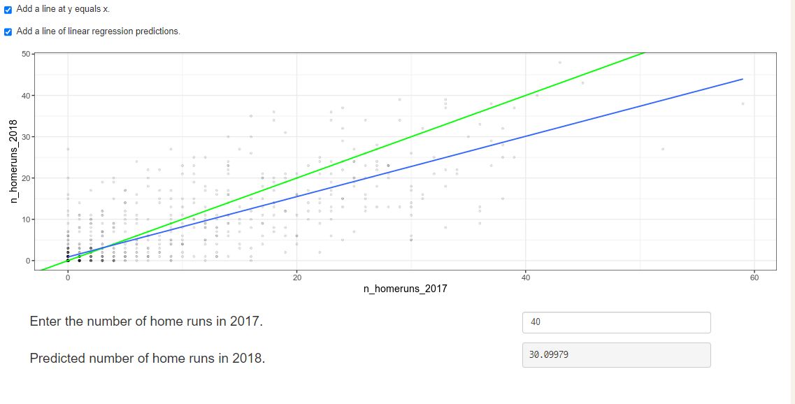
Someone who hit 40 home runs in 2017 is predicted to hit 10 fewer home runs the next year because regression to the mean states that, on average, extremely high values are not sustained.
Due to regression to the mean, it's common that one player or team that does really well one year, doesn't do as well the next. Likewise players or teams that perform very badly one year do better the next year.
Plotting consecutive portfolio returns
Regression to the mean is also an important concept in investing. Here you'll look at the annual returns from investing in companies in the Standard and Poor 500 index (S&P 500), in 2018 and 2019.
The sp500_yearly_returns dataset contains three columns:
| variable | meaning |
|---|---|
| symbol | Stock ticker symbol uniquely identifying the company. |
| return_2018 | A measure of investment performance in 2018. |
| return_2019 | A measure of investment performance in 2019. |
A positive number for the return means the investment increased in value; negative means it lost value.
Just as with baseball home runs, a naive prediction might be that the investment performance stays the same from year to year, lying on the y equals x line.
sp500_yearly_returns = pd.read_csv("./datasets/sp500_yearly_returns.csv")
sp500_yearly_returns.info()
fig = plt.figure()

# Plot the first layer: y = x
plt.axline(xy1=(0,0), slope=1, linewidth=2, color="green")

# Add scatter plot with linear regression trend line
sns.regplot(x="return_2018",
            y="return_2019",
            data=sp500_yearly_returns,
            ci = None,
            line_kws={"color": "black"})

# Set the axes so that the distances along the x and y axes look the same
plt.axis("equal")

# Show the plot
plt.show()

The regression trend line looks very different to the y equals x line. As the financial advisors say, "Past performance is no guarantee of future results."
Modeling consecutive returns
Let's quantify the relationship between returns in 2019 and 2018 by running a linear regression and making predictions. By looking at companies with extremely high or extremely low returns in 2018, we can see if their performance was similar in 2019.
mdl_returns = ols("return_2019 ~ return_2018", data = sp500_yearly_returns).fit()

# Print the parameters
print(mdl_returns.params)
mdl_returns = ols("return_2019 ~ return_2018", data=sp500_yearly_returns).fit()

# Create a DataFrame with return_2018 at -1, 0, and 1
explanatory_data = pd.DataFrame({"return_2018": [-1,0,1]})

# Use mdl_returns to predict with explanatory_data
print(mdl_returns.predict(explanatory_data))
Investments that gained a lot in value in 2018 on average gained only a small amount in 2019. Similarly, investments that lost a lot of value in 2018 on average also gained a small amount in 2019.
perch = fish[fish["species"] == "Perch"]
print(perch.head())
sns.regplot(x="length_cm",
            y="mass_g",
            data=perch,
            ci=None)
plt.show()

perch =perch.assign( length_cm_cubed= perch["length_cm"] ** 3)

sns.regplot(x="length_cm_cubed",
            y="mass_g",
            data=perch,
            ci=None)
plt.show()

mdl_perch = ols("mass_g ~ length_cm_cubed", data=perch).fit()
mdl_perch.params
explanatory_data = pd.DataFrame({"length_cm_cubed": np.arange(10, 41, 5) ** 3,
                                 "length_cm": np.arange(10, 41, 5)})

prediction_data = explanatory_data.assign(mass_g=mdl_perch.predict(explanatory_data))
plt.rcParams['figure.figsize'] = [7, 5]
fig = plt.figure()
sns.regplot(x="length_cm_cubed", y="mass_g",
            data=perch, ci=None)

sns.scatterplot(data=prediction_data,
                x="length_cm_cubed", y="mass_g",
                color="red", marker="s")

fig = plt.figure()
sns.regplot(x="length_cm", y="mass_g",
            data=perch, ci=None)

sns.scatterplot(data=prediction_data,
                x="length_cm", y="mass_g",
                color="red", marker="s")

Transforming the explanatory variable
If there is no straight-line relationship between the response variable and the explanatory variable, it is sometimes possible to create one by transforming one or both of the variables. Here, you'll look at transforming the explanatory variable.
You'll take another look at the Taiwan real estate dataset, this time using the distance to the nearest MRT (metro) station as the explanatory variable. You'll use code to make every commuter's dream come true:shortening the distance to the metro station by taking the square root. Take that, geography!
taiwan_real_estate["sqrt_dist_to_mrt_m"] = np.sqrt(
taiwan_real_estate["dist_to_mrt_m"])


plt.figure()

# Plot using the transformed variable
sns.regplot(x="sqrt_dist_to_mrt_m",
            y="price_twd_msq",
            data=taiwan_real_estate,
            ci=None)
plt.show()

taiwan_real_estate["sqrt_dist_to_mrt_m"] = np.sqrt(taiwan_real_estate["dist_to_mrt_m"])

# Run a linear regression of price_twd_msq vs. sqrt_dist_to_mrt_m
mdl_price_vs_dist = ols("price_twd_msq ~ sqrt_dist_to_mrt_m", data=taiwan_real_estate).fit()

# Print the parameters
display(mdl_price_vs_dist.params)

explanatory_data = pd.DataFrame({"sqrt_dist_to_mrt_m": np.sqrt(np.arange(0, 81, 10) ** 2),
                                "dist_to_mrt_m": np.arange(0, 81, 10) ** 2})

# Create prediction_data by adding a column of predictions to explantory_data
prediction_data = explanatory_data.assign(
    price_twd_msq = mdl_price_vs_dist.predict(explanatory_data)
)

# Print the result
display(prediction_data)
taiwan_real_estate["sqrt_dist_to_mrt_m"] = np.sqrt(taiwan_real_estate["dist_to_mrt_m"])

# Run a linear regression of price_twd_msq vs. sqrt_dist_to_mrt_m
mdl_price_vs_dist = ols("price_twd_msq ~ sqrt_dist_to_mrt_m", data=taiwan_real_estate).fit()

# Use this explanatory data
explanatory_data = pd.DataFrame({"sqrt_dist_to_mrt_m": np.sqrt(np.arange(0, 81, 10) ** 2),
                                "dist_to_mrt_m": np.arange(0, 81, 10) ** 2})

# Use mdl_price_vs_dist to predict explanatory_data
prediction_data = explanatory_data.assign(
    price_twd_msq = mdl_price_vs_dist.predict(explanatory_data)
)

fig = plt.figure()
sns.regplot(x="sqrt_dist_to_mrt_m", y="price_twd_msq", data=taiwan_real_estate, ci=None)

# Add a layer of your prediction points
sns.scatterplot(data = prediction_data, x="sqrt_dist_to_mrt_m", y="price_twd_msq", color="red")
plt.show()

Transforming the response variable too
The response variable can be transformed too, but this means you need an extra step at the end to undo that transformation. That is, you "back transform" the predictions.
In the video, you saw the first step of the digital advertising workflow:spending money to buy ads, and counting how many people see them (the "impressions"). The next step is determining how many people click on the advert after seeing it.
ad_conversion = pd.read_csv("./datasets/ad_conversion.csv")
display(ad_conversion.info())
ad_conversion["qdrt_n_impressions"] = np.power(ad_conversion["n_impressions"], 0.25)
ad_conversion["qdrt_n_clicks"] = np.power(ad_conversion["n_clicks"], 0.25)

plt.figure()

# Plot using the transformed variables
sns.regplot(x="qdrt_n_impressions",
            y="qdrt_n_clicks",
            data=ad_conversion,
            ci=None)
plt.show()

ad_conversion["qdrt_n_impressions"] = ad_conversion["n_impressions"] ** 0.25
ad_conversion["qdrt_n_clicks"] = ad_conversion["n_clicks"] ** 0.25

mdl_click_vs_impression = ols("qdrt_n_clicks ~ qdrt_n_impressions", data=ad_conversion).fit()

explanatory_data = pd.DataFrame({"qdrt_n_impressions": np.arange(0, 3e6+1, 5e5) ** .25,
                                 "n_impressions": np.arange(0, 3e6+1, 5e5)})

# Complete prediction_data
prediction_data = explanatory_data.assign(
    qdrt_n_clicks = mdl_click_vs_impression.predict(explanatory_data)
)

# Print the result
display(prediction_data)
Back transformation
In the previous exercise, you transformed the response variable, ran a regression, and made predictions. But you're not done yet! In order to correctly interpret and visualize your predictions, you'll need to do a back-transformation.
prediction_data["n_clicks"] = prediction_data["qdrt_n_clicks"] **4
display(prediction_data)
prediction_data["n_clicks"] = prediction_data["qdrt_n_clicks"] ** 4

# Plot the transformed variables
fig = plt.figure()
sns.regplot(x="qdrt_n_impressions", y="qdrt_n_clicks", data=ad_conversion, ci=None)

# Add a layer of your prediction points
sns.scatterplot(data=prediction_data, x="qdrt_n_impressions", y="qdrt_n_clicks", color="red")
plt.show()

mdl_bream = ols("mass_g ~ length_cm", data=bream).fit()
display(mdl_bream.summary())
mdl_bream.rsquared
Residual standard error (RSE)
- A "typical" difference between a prediction and an observed response
- It has the same unit as the response variable.
- $MSE = RSE^2$
mse = mdl_bream.mse_resid
print('mse: ', mse)
rse = np.sqrt(mse)
print("rse: ", rse)
residuals_sq = mdl_bream.resid ** 2
resid_sum_of_sq = sum(residuals_sq)
deg_freedom = len(bream.index) - 2

print('mse: ', resid_sum_of_sq/deg_freedom)

print("rse :", np.sqrt(resid_sum_of_sq/deg_freedom))
residuals_sq = mdl_bream.resid ** 2
resid_sum_of_sq = sum(residuals_sq)
n_obs = len(bream.index)
rmse = np.sqrt(resid_sum_of_sq/n_obs)
print("rmse :", rmse)
Interpreting RSE
- mdl_bream has an RSE of 74 .
The difference between predicted bream masses and observed bream masses is typically about 74g.
Coefficient of determination
The coefficient of determination is a measure of how well the linear regression line fits the observed values. For simple linear regression, it is equal to the square of the correlation between the explanatory and response variables.
Here, you'll take another look at the second stage of the advertising pipeline:modeling the click response to impressions. Two models are available: mdl_click_vs_impression_orig models n_clicks versus n_impressions. mdl_click_vs_impression_trans is the transformed model you saw in Chapter 2. It models n_clicks to the power of 0.25 versus n_impressions to the power of 0.25.
mdl_click_vs_impression_orig = mdl_click_vs_impression =ols("n_clicks ~ n_impressions", data=ad_conversion).fit()

mdl_click_vs_impression_trans= mdl_click_vs_impression =  ols("qdrt_n_clicks ~ qdrt_n_impressions", data=ad_conversion).fit()
display(mdl_click_vs_impression_orig.summary())

# Print a summary of mdl_click_vs_impression_trans
display(mdl_click_vs_impression_trans.summary())
print(mdl_click_vs_impression_orig.rsquared)

# Print the coeff of determination for mdl_click_vs_impression_trans
print(mdl_click_vs_impression_trans.rsquared)
Question: mdl_click_vs_impression_orig has a coefficient of determination of 0.89. Which statement about the model is true?
Possible Answers
The number of clicks explains 89% of the variability in the number of impressions.
The number of impressions explains 89% of the variability in the number of clicks.
The model is correct 89% of the time.
The correlation between the number of impressions and the number of clicks is 0.89.
The transformed model has a higher coefficient of determination than the original model, suggesting that it gives a better fit to the data.
Residual standard error
Residual standard error (RSE) is a measure of the typical size of the residuals. Equivalently, it's a measure of how wrong you can expect predictions to be. Smaller numbers are better, with zero being a perfect fit to the data.
mse_orig = mdl_click_vs_impression_orig.mse_resid

# Calculate rse_orig for mdl_click_vs_impression_orig and print it
rse_orig = np.sqrt(mse_orig)
print("RSE of original model: ", rse_orig)

# Calculate mse_trans for mdl_click_vs_impression_trans
mse_trans = mdl_click_vs_impression_trans.mse_resid

# Calculate rse_trans for mdl_click_vs_impression_trans and print it
rse_trans = np.sqrt(mse_trans)
print("RSE of transformed model: ", rse_trans)
Question: mdl_click_vs_impression_orig has an RSE of about 20. Which statement is true?
Possible Answers:
The model explains 20% of the variability in the number of clicks.
20% of the residuals are typically greater than the observed values.
The typical difference between observed number of clicks and predicted number of clicks is 20.
The typical difference between observed number of impressions and predicted number of impressions is 20.
The model predicts that you get one click for every 20 observed impressions.
Note:
- Since mdl_click_vs_impression_orig has an RSE of about 20, mdl_click_vs_impression_trans has an RSE of about 0.2.). The transformed model - mdl_click_vs_impression_trans gives more accurate predictions.
- RSE is a measure of accuracy for regression models. It even works on other other statistical model types like regression trees, so you can compare accuracy across different classes of models.
Residuals vs. fitted values
Here you can see diagnostic plots of residuals versus fitted values for two models on advertising conversion.
Original model (n_clicks versus n_impressions):
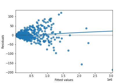
Transformed model (n_clicks 0.25 versus n_impressions 0.25):
![]()
Look at the numbers on the y-axis scales and how well the trend lines follow the line. Which statement is true?
Possible Answers:
The residuals track the $y=0$ line more closely in the original model compared to the transformed model, indicating that the original model is a better fit for the data.
The residuals track the $y=0$ line more closely in the transformed model compared to the original model, indicating that the original model is a better fit for the data.
The residuals track the $y=0$ line more closely in the original model compared to the transformed model, indicating that the transformed model is a better fit for the data.
The residuals track the $y=0$ line more closely in the transformed model compared to the original model, indicating that the transformed model is a better fit for the data.
In a good model, the residuals should have a trend line close to zero.
Q-Q plot of residuals
Here are normal Q-Q plots of the previous two models.
Original model (n_clicks versus n_impressions):
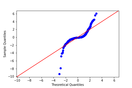
Transformed model (n_clicks 0.25 versus n_impressions 0.25):
![]()
Look at how well the points track the "normality" line. Which statement is true?
Possible Answers:
The residuals track the "normality" line more closely in the original model compared to the transformed model, indicating that the original model is a better fit for the data.
The residuals track the "normality" line more closely in the original model compared to the transformed model, indicating that the transformed model is a better fit for the data.
The residuals track the "normality" line more closely in the transformed model compared to the original model, indicating that the transformed model is a better fit for the data.
The residuals track the "normality" line more closely in the transformed model compared to the original model, indicating that the original model is a better fit for the data.
If the residuals from the model are normally distributed, then the points will track the line on the Q-Q plot. In this case, neither model is perfect, but the transformed model is closer.
Scale-location
Here are normal scale-location plots of the previous two models. That is, they show the size of residuals versus fitted values.
Original model (n_clicks versus n_impressions):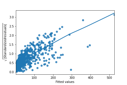 Transformed model (n_clicks 0.25 versus n_impressions 0.25):
![]()
Look at the numbers on the y-axis and the slope of the trend line. Which statement is true?
Possible Answers:
The size of the standardized residuals is more consistent in the original model compared to the transformed model, indicating that the original model is a better fit for the data.
The size of the standardized residuals is more consistent in the transformed model compared to the original model, indicating that the transformed model is a better fit for the data.
The size of the standardized residuals is more consistent in the transformed model compared to the original model, indicating that the original model is a better fit for the data.
The size of the standardized residuals is more consistent in the original model compared to the transformed model, indicating that the transformed model is a better fit for the data.
Drawing diagnostic plots
It's time for you to draw these diagnostic plots yourself using the Taiwan real estate dataset and the model of house prices versus number of convenience stores.
sns.residplot(x="n_convenience", y="price_twd_msq", data=taiwan_real_estate, lowess = True)
plt.xlabel("Fitted values")
plt.ylabel("Residuals")

# Show the plot
plt.show()

from statsmodels.api import qqplot

# Create the Q-Q plot of the residuals
qqplot(data=mdl_price_vs_conv.resid, fit=True, line="45")

# Show the plot
plt.show()

model_norm_residuals = mdl_price_vs_conv.get_influence().resid_studentized_internal
model_norm_residuals_abs_sqrt = np.sqrt(np.abs(model_norm_residuals))

# Create the scale-location plot
sns.regplot(x=mdl_price_vs_conv.fittedvalues, y=model_norm_residuals_abs_sqrt, ci=None, lowess=True, scatter_kws={"color": "blue"}, line_kws={"color": "red"})
plt.xlabel("Fitted values")
plt.ylabel("Sqrt of abs val of stdized residuals")

# Show the plot
plt.show()

plt.rcParams['figure.figsize'] = [7.5, 5]
roach = fish[fish["species"] == "Roach"]
# Which points are outliers?
sns.regplot(x="length_cm",
            y="mass_g",
            data=roach,
            ci=None)
plt.show()

roach["extreme_l"] = ((roach["length_cm"] < 15) | (roach["length_cm"] > 26))
fig = plt.figure()

sns.regplot(x="length_cm",
            y="mass_g",
            data=roach,
            ci=None)
sns.scatterplot(x="length_cm",
            y="mass_g",
            hue="extreme_l",
            data=roach)
plt.show()

roach["extreme_m"] = roach["mass_g"] < 1
fig = plt.figure()
sns.regplot(x="length_cm",
            y="mass_g",
            data=roach,
            ci=None)

sns.scatterplot(x="length_cm",
                y="mass_g",
                hue="extreme_l",
                style="extreme_m",
                data=roach)

plt.show()

mdl_roach = ols("mass_g ~ length_cm", data=roach).fit()
summary_roach = mdl_roach.get_influence().summary_frame()
roach["leverage"] = summary_roach["hat_diag"]
display(roach.head())
roach["cooks_dist"] = summary_roach["cooks_d"]
display(roach.head())
display(roach.sort_values("cooks_dist", ascending = False)[:5])
roach_not_short = roach[roach["length_cm"] != 12.9]
sns.regplot(x="length_cm",
            y="mass_g",
            data=roach,
            ci=None,
            line_kws={"color": "green"})
sns.regplot(x="length_cm",
            y="mass_g",
            data=roach_not_short,
            ci=None,
            line_kws={"color": "red"})
plt.show()

Leverage
Leverage measures how unusual or extreme the explanatory variables are for each observation. Very roughly, high leverage means that the explanatory variable has values that are different from other points in the dataset. In the case of simple linear regression, where there is only one explanatory value, this typically means values with a very high or very low explanatory value.
Here, you'll look at highly leveraged values in the model of house price versus the square root of distance from the nearest MRT station in the Taiwan real estate dataset.

Guess which observations you think will have a high leverage, then move the slider to find out.
Which statement is true?
Observations with a large distance to the nearest MRT station have the highest leverage, because most of the observations have a short distance, so long distances are more extreme.
Highly leveraged points are the ones with explanatory variables that are furthest away from the others.
Influence
Influence measures how much a model would change if each observation was left out of the model calculations, one at a time. That is, it measures how different the prediction line would look if you would run a linear regression on all data points except that point, compared to running a linear regression on the whole dataset.
The standard metric for influence is Cook's distance, which calculates influence based on the residual size and the leverage of the point.
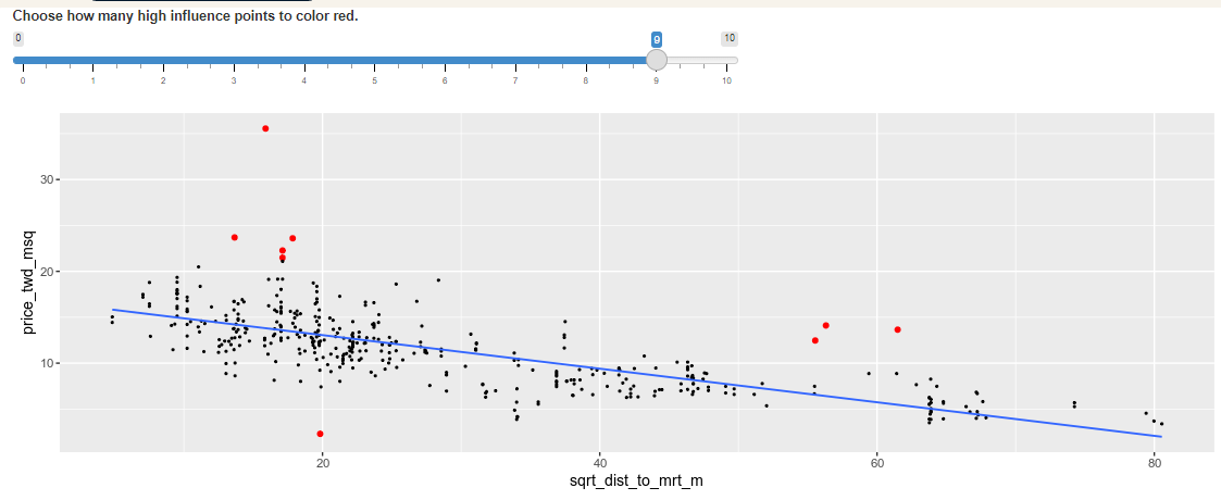
You can see the same model as last time:house price versus the square root of distance from the nearest MRT station in the Taiwan real estate dataset. Guess which observations you think will have a high influence, then move the slider to find out.
Which statement is true?
Observations far away from the trend line have high influence, because they have large residuals and are far away from other observations.
The majority of the influential houses were those with prices that were much higher than the model predicted (and one with a price that was much lower).
Extracting leverage and influence
taiwan_real_estate["sqrt_dist_to_mrt_m"] = np.sqrt(taiwan_real_estate["dist_to_mrt_m"])

# Run a linear regression of price_twd_msq vs. sqrt_dist_to_mrt_m
mdl_price_vs_dist = ols("price_twd_msq ~ sqrt_dist_to_mrt_m", data=taiwan_real_estate).fit()
summary_info = mdl_price_vs_dist.get_influence().summary_frame()

# Add the hat_diag column to taiwan_real_estate, name it leverage
taiwan_real_estate["leverage"] = summary_info["hat_diag"]

# Sort taiwan_real_estate by leverage in descending order and print the head
display(taiwan_real_estate.sort_values("leverage", ascending = False).head())
summary_info = mdl_price_vs_dist.get_influence().summary_frame()

# Add the hat_diag column to taiwan_real_estate, name it leverage
taiwan_real_estate["leverage"] = summary_info["hat_diag"]

# Add the cooks_d column to taiwan_real_estate, name it cooks_dist
taiwan_real_estate["cooks_dist"] = summary_info["cooks_d"]

# Sort taiwan_real_estate by cooks_dist in descending order and print the head.
display(taiwan_real_estate.sort_values("cooks_dist", ascending = False).head())
churn = pd.read_csv("./datasets/churn.csv")
churn.head()
mdl_churn_vs_recency_lm = ols("has_churned ~ time_since_last_purchase",
data=churn).fit()
print(mdl_churn_vs_recency_lm.params)

intercept, slope = mdl_churn_vs_recency_lm.params
sns.scatterplot(x="time_since_last_purchase",
                y="has_churned",
                data=churn)
plt.axline(xy1=(0, intercept),
slope=slope)
plt.show()

sns.scatterplot(x="time_since_last_purchase",
                y="has_churned",
                data=churn)
plt.axline(xy1=(0,intercept),
slope=slope)
plt.xlim(-10, 10)
plt.ylim(-0.2, 1.2)
plt.show()

from statsmodels.formula.api import logit
mdl_churn_vs_recency_logit = logit("has_churned ~ time_since_last_purchase",
data=churn).fit()
print(mdl_churn_vs_recency_logit.params)
sns.regplot(x="time_since_last_purchase",
            y="has_churned",
            data=churn,
            ci=None,
            logistic=True)

plt.axline(xy1=(0,intercept),
            slope=slope,
            color="black")

plt.show()

Exploring the explanatory variables
When the response variable is logical, all the points lie on the $y=0$ and $y=1$ lines, making it difficult to see what is happening. In the video, until you saw the trend line, it wasn't clear how the explanatory variable was distributed on each line. This can be solved with a histogram of the explanatory variable, grouped by the response.
You will use these histograms to get to know the financial services churn dataset seen in the video.
sns.displot(data=churn,
            x="time_since_last_purchase",
            col="has_churned")
plt.show()

sns.displot(data=churn,
            x="time_since_first_purchase",
            col="has_churned")
plt.show()

Visualizing linear and logistic models
As with linear regressions, regplot() will draw model predictions for a logistic regression without you having to worry about the modeling code yourself. To see how the predictions differ for linear and logistic regressions, try drawing both trend lines side by side. Spoiler:you should see a linear (straight line) trend from the linear model, and a logistic (S-shaped) trend from the logistic model.
sns.regplot(x="time_since_first_purchase",
            y="has_churned",
            data=churn,
            ci=None,
            line_kws={"color": "red"})

# Draw a logistic regression trend line and a scatter plot of time_since_first_purchase vs. has_churned
sns.regplot(x="time_since_first_purchase",
            y="has_churned",
            data=churn,
            ci=None,
            logistic=True,
            line_kws={"color": "blue"})

plt.show()

Logistic regression with logit()
Logistic regression requires another function from statsmodels.formula.api:logit(). It takes the same arguments as ols(): a formula and data argument. You then use .fit() to fit the model to the data. Here, you'll model how the length of relationship with a customer affects churn.
# Import logit
from statsmodels.formula.api import logit

# Fit a logistic regression of churn vs.
# length of relationship using the churn dataset
mdl_churn_vs_relationship = logit('has_churned~time_since_first_purchase', data=churn).fit()

# Print the parameters of the fitted model
print(mdl_churn_vs_relationship.params)
Probabilities
There are four main ways of expressing the prediction from a logistic regression model – we'll look at each of them over the next four exercises. Firstly, since the response variable is either "yes" or "no", you can make a prediction of the probability of a "yes". Here, you'll calculate and visualize these probabilities.
Two variables are available:
- mdl_churn_vs_relationship is the fitted logistic regression model of has_churned versus time_since_first_purchase.
- explanatory_data is a DataFrame of explanatory values.
explanatory_data = pd.DataFrame({'time_since_first_purchase': np.arange(-1.5, 4.1, .25)})
# explanatory_data
prediction_data = explanatory_data.assign(
  has_churned = mdl_churn_vs_relationship.predict(explanatory_data)
)

# Print the head
print(prediction_data.head())
prediction_data = explanatory_data.assign(
    has_churned = mdl_churn_vs_relationship.predict(explanatory_data)
)

fig = plt.figure()

# Create a scatter plot with logistic trend line
sns.regplot(x="time_since_first_purchase",
            y="has_churned",
            data=churn,
            ci=None,
            logistic=True)

# Overlay with prediction_data, colored red
sns.scatterplot(x="time_since_first_purchase",
                y="has_churned",
                data=prediction_data,
                color="darkred")

plt.show()

Most likely outcome
When explaining your results to a non-technical audience, you may wish to side-step talking about probabilities and simply explain the most likely outcome. That is, rather than saying there is a 60% chance of a customer churning, you say that the most likely outcome is that the customer will churn. The trade-off here is easier interpretation at the cost of nuance.
prediction_data["most_likely_outcome"] = np.round(prediction_data["has_churned"])

# Print the head
print(prediction_data.head())
prediction_data["most_likely_outcome"] = np.round(prediction_data["has_churned"])

fig = plt.figure()

# Create a scatter plot with logistic trend line (from previous exercise)
sns.regplot(x="time_since_first_purchase",
            y="has_churned",
            data=churn,
            ci=None,
            logistic=True)

# Overlay with prediction_data, colored red
sns.scatterplot(x="time_since_first_purchase",
                y="most_likely_outcome",
                data=prediction_data,
                color="red")

plt.show()

Odds ratio
Odds ratios compare the probability of something happening with the probability of it not happening. This is sometimes easier to reason about than probabilities, particularly when you want to make decisions about choices. For example, if a customer has a 20% chance of churning, it may be more intuitive to say "the chance of them not churning is four times higher than the chance of them churning".
prediction_data["odds_ratio"] = prediction_data["has_churned"] / (1 - prediction_data["has_churned"])

# Print the head
print(prediction_data.head())
prediction_data["odds_ratio"] = prediction_data["has_churned"] / (1 - prediction_data["has_churned"])

# Create a new figure
fig = plt.figure()

# Create a line plot of odds_ratio vs time_since_first_purchase
sns.lineplot(x='time_since_first_purchase', y='odds_ratio', data = prediction_data)

# Add a dotted horizontal line at odds_ratio = 1
plt.axhline(y=1, linestyle="dotted")

# Show the plot
plt.show()

Odds ratios provide an alternative to probabilities that make it easier to compare positive and negative responses.
Log odds ratio
One downside to probabilities and odds ratios for logistic regression predictions is that the prediction lines for each are curved. This makes it harder to reason about what happens to the prediction when you make a change to the explanatory variable. The logarithm of the odds ratio (the "log odds ratio" or "logit") does have a linear relationship between predicted response and explanatory variable. That means that as the explanatory variable changes, you don't see dramatic changes in the response metric - only linear changes.
Since the actual values of log odds ratio are less intuitive than (linear) odds ratio, for visualization purposes it's usually better to plot the odds ratio and apply a log transformation to the y-axis scale.
prediction_data["log_odds_ratio"] = np.log(prediction_data['odds_ratio'])

# Print the head
print(prediction_data.head())
prediction_data["log_odds_ratio"] = np.log(prediction_data["odds_ratio"])

fig = plt.figure()

# Update the line plot: log_odds_ratio vs. time_since_first_purchase
sns.lineplot(x="time_since_first_purchase",
             y="log_odds_ratio",
             data=prediction_data)

# Add a dotted horizontal line at log_odds_ratio = 0
plt.axhline(y=0, linestyle="dotted")

plt.show()

Quantifying logistic regression fit
Resid plot, QQplot & Scale location plot are less useful in the case of logistic regression. Instead, we can use confusion matrices to analyze the fit performance. With True/False positive & negative outcomes. We can also compute metrics based on various ratios.
Accuracy : proportion of correct predictions. Higher better. $$ \dfrac{TN+TP}{TN+FN+FP+TP}$$
Sensitivity : proportions of observations where the actual response was true and where the model also predicted it was true. Higher better.
$$ \dfrac{TP} {FN + TP}$$Specificity : proportions of observations where the actual was false and where the model also predicted it was false. Higher better. $$ \dfrac{TN} {TN + FP}$$
Calculating the confusion matrix
A confusion matrix (occasionally called a confusion table) is the basis of all performance metrics for models with a categorical response (such as a logistic regression). It contains the counts of each actual response-predicted response pair. In this case, where there are two possible responses (churn or not churn), there are four overall outcomes.
- True positive:The customer churned and the model predicted they would.- False positive: The customer didn't churn, but the model predicted they would.
- True negative: The customer didn't churn and the model predicted they wouldn't.
- False negative: The customer churned, but the model predicted they wouldn't.
actual_response = churn["has_churned"]

# Get the predicted responses
predicted_response = np.round(mdl_churn_vs_relationship.predict())

# Create outcomes as a DataFrame of both Series
outcomes = pd.DataFrame({"actual_response": actual_response,
                         "predicted_response": predicted_response})

# Print the outcomes
print(outcomes.value_counts(sort = False))
Drawing a mosaic plot of the confusion matrix
While calculating the performance matrix might be fun, it would become tedious if you needed multiple confusion matrices of different models. Luckily, the .pred_table() method can calculate the confusion matrix for you.
Additionally, you can use the output from the .pred_table() method to visualize the confusion matrix, using the mosaic() function.
from statsmodels.graphics.mosaicplot import mosaic

# Calculate the confusion matrix conf_matrix
conf_matrix = mdl_churn_vs_relationship.pred_table()

# Print it
print(conf_matrix)

# Draw a mosaic plot of conf_matrix
mosaic(conf_matrix)
plt.show()

Accuracy, sensitivity, specificity
Measuring logistic model performance
As you know by now, several metrics exist for measuring the performance of a logistic regression model. In this last exercise, you'll manually calculate accuracy, sensitivity, and specificity. Recall the following definitions:Accuracy is the proportion of predictions that are correct.
$$ Accuracy = \dfrac{TN+TP}{TN+FN+FP+TP}$$
Sensitivity is the proportion of true observations that are correctly predicted by the model as being true.
$$ Sensitivity = \dfrac{TP} {FN + TP}$$
Specificity is the proportion of false observations that are correctly predicted by the model as being false. $$ Specificity = \dfrac{TN} {TN + FP}$$
TN = conf_matrix[0,0]
TP = conf_matrix[1,1]
FN = conf_matrix[1,0]
FP = conf_matrix[0,1]

# Calculate and print the accuracy
accuracy = (TN + TP) / (TN + FN + FP + TP)
print("accuracy: ", accuracy)

# Calculate and print the sensitivity
sensitivity = TP / (TP + FN)
print("sensitivity: ", sensitivity)

# Calculate and print the specificity
specificity = TN / (TN + FP)
print("specificity: ", specificity)