


Machine Learning for Time Series Data in Python
Time series data is ubiquitous. Whether it be stock market fluctuations, sensor data recording climate change, or activity in the brain, any signal that changes over time can be described as a time series.
Machine learning has emerged as a powerful method for leveraging complexity in data in order to generate predictions and insights into the problem one is trying to solve. This course is an intersection between these two worlds of machine learning and time series data, and covers feature engineering, spectograms, and other advanced techniques in order to classify heartbeat sounds and predict stock prices.
PREREQUISITES:Manipulating Time Series Data in Python, Visualizing Time Series Data in Python, Machine Learning with scikit-learn
Download Datasets and Presentation slides for this post HERE
This post is 5th part of Time Series with Python Track from DataCamp. The track includes:
import numpy as np
import warnings
import pandas as pd
import matplotlib.pyplot as plt
import matplotlib as mpl
pd.set_option('display.expand_frame_repr', False)
plt.style.use('seaborn')
mpl.rcParams['figure.dpi'] = 150
mpl.rcParams['figure.figsize'] = (25, 20)
mpl.rcParams['axes.grid'] = True
mpl.rcParams["xtick.labelsize"], mpl.rcParams["ytick.labelsize"] = 25,25
mpl.rcParams["legend.fontsize"] = 20
warnings.filterwarnings("ignore")
Identifying a time series
Which of the following data sets is not considered time series data?
- Test grades for the last fall and spring semesters of high-school students.
- A student's attendance record each week of the semester.
- The school's national annual ranking since 2000.
- A list of the average length of each class at the school ---> You don't have timestamps for each data point, so it is not
Plotting a time series (I)
In this exercise, you'll practice plotting the values of two time series without the time component.
Two DataFrames, data and data2 are available in your workspace.
Instructions:
- Plot the values column of both the data sets on top of one another, one per axis object.
data = pd.read_csv('datasets/data.csv', index_col=[0])
data2 = pd.read_csv('datasets/data2.csv', index_col=[0])
display(data.head())
display(data2.head())
fig, axs = plt.subplots(2, 1, figsize=(15, 10))
data.iloc[:1000].plot(y='data_values', ax=axs[0], title="data")
data2.iloc[:1000].plot(y='data_values', ax=axs[1], title="data2")
plt.show()

Plotting a time series (II)
You'll now plot both the datasets again, but with the included time stamps for each (stored in the column called "time"). Let's see if this gives you some more context for understanding each time series data.
Instructions:
- Plot data and data2 on top of one another, one per axis object.
- The x-axis should represent the time stamps and the y-axis should represent the
data = pd.read_csv('datasets/data_with_tstamp.csv', index_col=[0])
data2 = pd.read_csv('datasets/data2_with_tstamp.csv', index_col=[0])
display(data.head())
display(data2.head())
fig, axs = plt.subplots(2, 1, figsize=(15, 10))
data.iloc[:1000].plot(x='time', y='data_values', ax=axs[0])
data2.iloc[:1000].plot(x='time', y='data_values', ax=axs[1])
plt.show()

Fitting a simple model:classification In this exercise, you'll use the iris dataset (representing petal characteristics of a number of flowers) to practice using the scikit-learn API to fit a classification model. You can see a sample plot of the data to the right.
Note: This course assumes some familiarity with Machine Learning and scikit-learn. For an introduction to scikit-learn, we recommend the Supervised Learning with Scikit-Learn and Preprocessing for Machine Learning in Python courses.
Instructions:
- Print the first five rows of data.
- Extract the "petal length (cm)" and "petal width (cm)" columns of data and assign it to X.
- Fit a model on X and y.
data = pd.read_csv('datasets/iris.csv', index_col=[0])
import matplotlib as mpl
mpl.rcParams.update(mpl.rcParamsDefault)
plt.style.use('default')
display(data.head())
print("data.target.unique: ",data.target.unique())
colors = np.where(data["target"]==1,'purple','red')
data.plot.scatter(x='petal length (cm)', y='petal width (cm)', c=colors)

from sklearn.svm import LinearSVC
# Construct data for the model
X = data[['petal length (cm)','petal width (cm)']]
y = data[['target']]
# Fit the model
model = LinearSVC()
model.fit(X, y)
Predicting using a classification model
Now that you have fit your classifier, let's use it to predict the type of flower (or class) for some newly-collected flowers.
Information about petal width and length for several new flowers is stored in the variable targets. Using the classifier you fit, you'll predict the type of each flower.
Instructions:
- Predict the flower type using the array X_predict.
- Run the given code to visualize the predictions.
targets = pd.read_csv('datasets/targets.csv', index_col=[0])
X_predict = targets[['petal length (cm)', 'petal width (cm)']]
# Predict with the model
predictions = model.predict(X_predict)
print(predictions)
# [2 2 2 1 1 2 2 2 2 1 2 1 1 2 1 1 2 1 2 2]
# Visualize predictions and actual values
plt.scatter(X_predict['petal length (cm)'], X_predict['petal width (cm)'],
c=predictions, cmap=plt.cm.coolwarm)
plt.title("Predicted class values")
plt.show()
""" Note that the output of your predictions are all integers, representing that datapoint's predicted class."""

Fitting a simple model:regression
In this exercise, you'll practice fitting a regression model using data from the California housing market. A DataFrame called housing is available in your workspace. It contains many variables of data (stored as columns). Can you find a relationship between the following two variables?
- "MedHouseVal": the median house value for California districts (in $100,000s of dollars)
- "AveRooms" : average number of rooms per dwelling
Instructions:
- Prepare X and y DataFrames using the data in housing.
- X should be the Median House Value, y average number of rooms per dwelling.
- Fit a regression model that uses these variables (remember to shape the variables correctly!).
- Don't forget that each variable must be the correct shape for scikit-learn to use it!
housing = pd.read_csv("datasets/housing.csv", index_col=[0])
display(housing.info())
housing.plot.scatter(y='AveRooms', x='MedHouseVal')

housing[housing.isna().any(axis=1)]
housing.dropna(inplace=True)
from sklearn import linear_model
# Prepare input and output DataFrames
X = housing[['MedHouseVal']]
y = housing[['AveRooms']]
# Fit the model
model = linear_model.LinearRegression()
model.fit(X,y)
"""In regression, the output of your model is a continuous array of numbers, not class identity."""
Predicting using a regression model
Now that you've fit a model with the California housing data, lets see what predictions it generates on some new data. You can investigate the underlying relationship that the model has found between inputs and outputs by feeding in a range of numbers as inputs and seeing what the model predicts for each input.
A 1-D array new_inputs consisting of 100 "new" values for "MedHouseVal" (median house value) is available in your workspace along with the model you fit in the previous exercise.
Instructions:
- Review new_inputs in the shell.
- Reshape new_inputs appropriately to generate predictions.
- Run the given code to visualize the predictions.
new_inputs_df = pd.read_csv('./datasets/newinputs.csv', index_col=[0])
new_inputs = new_inputs_df.to_numpy()
new_inputs.reshape((100,))
predictions = model.predict(new_inputs.reshape(-1,1))
# Visualize the inputs and predicted values
plt.scatter(new_inputs, predictions, color='r', s=3)
plt.xlabel('inputs')
plt.ylabel('predictions')
plt.show()
""" Here the red line shows the relationship that your model found. As the number of rooms grows, the median house value rises linearly."""

Inspecting the classification data
In these final exercises of this chapter, you'll explore the two datasets you'll use in this course.
The first is a collection of heartbeat sounds. Hearts normally have a predictable sound pattern as they beat, but some disorders can cause the heart to beat abnormally. This dataset contains a training set with labels for each type of heartbeat, and a testing set with no labels. You'll use the testing set to validate your models.
As you have labeled data, this dataset is ideal for classification. In fact, it was originally offered as a part of a public Kaggle competition.
Instructions:
- Use glob to return a list of the .wav files in data_dir directory.
- Import the first audio file in the list using librosa.
- Generate a time array for the data.
- Plot the waveform for this file, along with the time array.
import librosa as lr
from glob import glob
data_dir = './files'
# List all the wav files in the folder
audio_files = glob(data_dir + '/*.wav')
print(len(audio_files))
# Read in the first audio file, create the time array
audio, sfreq = lr.load(audio_files[0])
time = np.arange(0, len(audio)) / sfreq
# Plot audio over time
fig, ax = plt.subplots()
ax.plot(time, audio)
ax.set(xlabel='Time (s)', ylabel='Sound Amplitude')
plt.show()
Output:

Inspecting the regression data
The next dataset contains information about company market value over several years of time. This is one of the most popular kind of time series data used for regression. If you can model the value of a company as it changes over time, you can make predictions about where that company will be in the future. This dataset was also originally provided as part of a public Kaggle competition.
In this exercise, you'll plot the time series for a number of companies to get an understanding of how they are (or aren't) related to one another.
Instructions:
- Import the data with Pandas (stored in the file 'prices.csv').
- Convert the index of data to datetime.
- Loop through each column of data and plot the the column's values over time.
mpl.rcParams['figure.figsize'] = (15, 10)
data = pd.read_csv('./datasets/prices_new.csv', index_col=0)
# Convert the index of the DataFrame to datetime
data.index = pd.to_datetime(data.index)
print(data.head())
# Loop through each column, plot its values over time
fig, ax = plt.subplots()
for column in data.columns:
data[column].plot(ax=ax, label=column)
ax.legend()
plt.show()
""" Note that each company's value is sometimes correlated with others, and sometimes not. Also note there are a lot of 'jumps' in there - what effect do you think these jumps would have on a predictive model? """

Some preprocessing steps to load the data for next sections.
import csv
import os
import re
def convert_txt_to_csv(file_path):
new_file_name = os.path.splitext(file_path)[0] + '.csv'
with open(file_path, "r") as f:
plain_str = f.read()
print(plain_str[:10], plain_str[-10:])
csv_data = re.match(r".*?b\'(.*)\'.*?", plain_str).group(1) # remove byte traces
print(csv_data[:10], csv_data[-10:])
csv_data = csv_data.replace('\\n', '\n') # remove \\n with actual new line chars
with open(new_file_name, 'w') as out:
out.write(csv_data)
files_to_convert = [
'./datasets/abnormal.txt',
'./datasets/normal.txt'
]
for file_path in files_to_convert:
convert_txt_to_csv(file_path)
abnormal_df = pd.read_csv('./datasets/abnormal.csv', index_col=[0])
display(abnormal_df.tail())
print(abnormal_df.info())
# Read in the data
normal_df = pd.read_csv('./datasets/normal.csv', index_col=[0])
display(normal_df.tail())
print(normal_df.info())
normal = normal_df.to_numpy()
print(normal.shape)
abnormal = abnormal_df.to_numpy()
print(abnormal.shape)
sfreq = 2205
# import inspect
# source = inspect.getsource(show_plot_and_make_titles)
# print(source)
def show_plot_and_make_titles():
axs[0, 0].set(title="Normal Heartbeats")
axs[0, 1].set(title="Abnormal Heartbeats")
plt.tight_layout()
plt.show()
Many repetitions of sounds
In this exercise, you'll start with perhaps the simplest classification technique:averaging across dimensions of a dataset and visually inspecting the result. You'll use the heartbeat data described in the last chapter. Some recordings are normal heartbeat activity, while others are abnormal activity. Let's see if you can spot the difference.
Two DataFrames, normal and abnormal, each with the shape of (n_times_points, n_audio_files) containing the audio for several heartbeats are available in your workspace. Also, the sampling frequency is loaded into a variable called sfreq. A convenience plotting function show_plot_and_make_titles() is also available in your workspace.
Instructions:
- First, create the time array for these audio files (all audios are the same length).
- Then, stack the values of the two DataFrames together (
normalandabnormal, in that order) so that you have a single array of shape (n_audio_files,n_times_points). - Finally, use the code provided to loop through each list item / axis, and plot the audio over time in the corresponding axis object.
- You'll plot normal heartbeats in the left column, and abnormal ones in the right column
import matplotlib as mpl
mpl.rcParams['figure.dpi'] = 200
mpl.rcParams['figure.figsize'] = (30, 15)
fig, axs = plt.subplots(3, 2, figsize=(30, 15), sharex=True, sharey=True)
# Calculate the time array
time = np.arange(normal.shape[0]) / sfreq
# Stack the normal/abnormal audio so you can loop and plot
stacked_audio = np.hstack([normal, abnormal]).T
# Loop through each audio file / ax object and plot
# .T.ravel() transposes the array, then unravels it into a 1-D vector for looping
for iaudio, ax in zip(stacked_audio, axs.T.ravel()):
ax.plot(time, iaudio)
show_plot_and_make_titles()
""" As you can see there is a lot of variability in the raw data, let's see if you can average out some of that noise to notice a difference."""

Invariance in time
While you should always start by visualizing your raw data, this is often uninformative when it comes to discriminating between two classes of data points. Data is usually noisy or exhibits complex patterns that aren't discoverable by the naked eye.
Another common technique to find simple differences between two sets of data is to average across multiple instances of the same class. This may remove noise and reveal underlying patterns (or, it may not).
In this exercise, you'll average across many instances of each class of heartbeat sound.
The two DataFrames (normal and abnormal) and the time array (time) from the previous exercise are available in your workspace.
Instructions:
- Average across the audio files contained in normal and abnormal, leaving the time dimension.
- Visualize these averages over time.
files_to_convert = [
'./datasets/invariance_abnormal.txt',
'./datasets/invariance_normal.txt'
]
for file_path in files_to_convert:
convert_txt_to_csv(file_path)
normal = pd.read_csv('./datasets/invariance_normal.csv', index_col=[0])
abnormal = pd.read_csv('./datasets/invariance_abnormal.csv', index_col=[0])
mean_normal = np.mean(normal, axis=1)
mean_abnormal = np.mean(abnormal, axis=1)
# Plot each average over time
fig, (ax1, ax2) = plt.subplots(1, 2, figsize=(17, 5), sharey=True)
ax1.plot(time, mean_normal)
ax1.set(title="Normal Data")
ax2.plot(time, mean_abnormal)
ax2.set(title="Abnormal Data")
plt.show()
"""Do you see a noticeable difference between the two? Maybe, but it's quite noisy. Let's see how you can dig into the data a bit further."""

Build a classification model
While eye-balling differences is a useful way to gain an intuition for the data, let's see if you can operationalize things with a model. In this exercise, you will use each repetition as a datapoint, and each moment in time as a feature to fit a classifier that attempts to predict abnormal vs. normal heartbeats using only the raw data.
We've split the two DataFrames (normal and abnormal) into X_train, X_test, y_train, and y_test.
Instructions:
- Create an instance of the Linear SVC model and fit the model using the training data.
- Use the testing data to generate predictions with the model.
- Score the model using the provided code.
files_to_convert = [ './datasets/abnormal_full.txt',
'./datasets/normal_full.txt' ]
for file_path in files_to_convert:
convert_txt_to_csv(file_path)
normal = pd.read_csv('./datasets/normal_full.csv', index_col=0).select_dtypes(np.float64).astype(np.float32)
abnormal = pd.read_csv('./datasets/abnormal_full.csv', index_col=0).select_dtypes(np.float64).astype(np.float32)
display(normal.head())
display(abnormal.head())
print(normal.shape)
print(abnormal.shape)
stacked_audio = np.hstack([normal, abnormal]).T
X = stacked_audio
X.shape
y = np.concatenate((np.full((len(normal.T), 1), 'normal'), np.full((len(abnormal.T), 1), 'abnormal')))
y.shape
from sklearn.model_selection import train_test_split
X_train, X_test, y_train, y_test = train_test_split(X, y, test_size=0.3, random_state=42)
print(type(X), X[:2],X.shape)
print(type(y),y[:2], y.shape)
len(y_test)
from sklearn.svm import LinearSVC
# Initialize and fit the model
model = LinearSVC()
model.fit(X_train,y_train)
# Generate predictions and score them manually
predictions = model.predict(X_test)
print(sum(predictions == y_test.squeeze()) / len(y_test))
"""Note that your predictions didn't do so well. That's because the features you're using as inputs to the model (raw data) aren't very good at differentiating classes. Next, you'll explore how to calculate some more complex features that may improve the results."""
Calculating the envelope of sound
One of the ways you can improve the features available to your model is to remove some of the noise present in the data. In audio data, a common way to do this is to smooth the data and then rectify it so that the total amount of sound energy over time is more distinguishable. You'll do this in the current exercise.
A heartbeat file is available in the variable audio.
Instructions:
- Visualize the raw audio you'll use to calculate the envelope.
import h5py
path = './datasets/audio_munged.hdf5'
f = h5py.File(path,'r')
list(f.keys())
f['h5io'].keys()
sfreq = f['h5io']['key_sfreq'][0] # 2205
key_data = pd.read_hdf(path, key='h5io/key_data')
audio = key_data.squeeze()
display(audio.shape)
key_meta = pd.read_hdf(path, key='h5io/key_meta')
display(key_meta.head())
display(key_meta.info())
labels = key_meta["label"].to_numpy()
labels
Opps! The dataset that Datacamp provided could not be loaded like the one in their exercise. Let's load it manually.
audio = pd.read_csv('./datasets/audio.csv', index_col=0)
audio.plot(figsize=(10, 5))
plt.show()

- Rectify the audio.
- Plot the result.
audio_rectified = audio.apply(np.abs)
# Plot the result
audio_rectified.plot(figsize=(10, 5))
plt.show()

- Smooth the audio file by applying a rolling mean.
- Plot the result.
audio_rectified_smooth = audio_rectified.rolling(50).mean()
# Plot the result
audio_rectified_smooth.plot(figsize=(10, 5))
plt.show()

By calculating the envelope of each sound and smoothing it, you've eliminated much of the noise and have a cleaner signal to tell you when a heartbeat is happening.
Calculating features from the envelope
Now that you've removed some of the noisier fluctuations in the audio, let's see if this improves your ability to classify.
audio_rectified_smooth from the previous exercise is available in your workspace.
Instructions:
- Calculate the mean, standard deviation, and maximum value for each heartbeat sound.
- Column stack these stats in the same order.
- Use cross-validation to fit a model on each CV iteration.
path = './datasets/audio_munged.hdf5'
df = pd.read_hdf(path, key='h5io/key_data')
audio = df.squeeze()
# Smooth by applying a rolling mean
audio_rectified = audio.apply(np.abs)
audio_rectified_smooth = audio_rectified.rolling(50).mean()
audio_rectified_smooth
model = LinearSVC()
means = np.mean(audio_rectified_smooth, axis=0)
stds = np.std(audio_rectified_smooth, axis=0)
maxs = np.max(audio_rectified_smooth, axis=0)
# Create the X and y arrays
X = np.column_stack([means, stds, maxs])
y = labels.reshape([-1, 1])
# Fit the model and score on testing data
from sklearn.model_selection import cross_val_score
percent_score = cross_val_score(model, X, y, cv=5)
print(np.mean(percent_score))
This model is both simpler (only 3 features) and more understandable (features are simple summary statistics of the data).
Derivative features:The tempogram One benefit of cleaning up your data is that it lets you compute more sophisticated features. For example, the envelope calculation you performed is a common technique in computing tempo and rhythm features. In this exercise, you'll use
librosato compute some tempo and rhythm features for heartbeat data, and fit a model once more.
Note that librosa functions tend to only operate on numpy arrays instead of DataFrames, so we'll access our Pandas data as a Numpy array with the .values attribute.
Instructions:
- Use
librosato calculate a tempogram of each heartbeat audio. - Calculate the mean, standard deviation, and maximum of each tempogram (this time using DataFrame methods)
- Column stack these tempo features (mean, standard deviation, and maximum) in the same order.
- Score the classifier with cross-validation.
model = LinearSVC()
import librosa as lr
# Calculate the tempo of the sounds
tempos = []
for col, i_audio in audio.items():
tempos.append(lr.beat.tempo(i_audio.values, sr=sfreq, hop_length=2**6, aggregate=None))
# Convert the list to an array so you can manipulate it more easily
tempos = np.array(tempos)
# Calculate statistics of each tempo
tempos_mean = tempos.mean(axis=-1)
tempos_std = tempos.std(axis=-1)
tempos_max = tempos.max(axis=-1)
X = np.column_stack([means, stds, maxs, tempos_mean, tempos_std, tempos_max])
y = labels.reshape([-1, 1])
# Fit the model and score on testing data
percent_score = cross_val_score(model, X, y, cv=5)
print(np.mean(percent_score))
"""Note that your predictive power may not have gone up (because this dataset is quite small), but you now have a more rich feature representation of audio that your model can use!"""
Spectrograms of heartbeat audio
Spectral engineering is one of the most common techniques in machine learning for time series data. The first step in this process is to calculate a spectrogram of sound. This describes what spectral content (e.g., low and high pitches) are present in the sound over time. In this exercise, you'll calculate a spectrogram of a heartbeat audio file.
We've loaded a single heartbeat sound in the variable audio.
Instructions:
- Import the short-time fourier transform (
stft) function fromlibrosa.core. - Calculate the spectral content (using the short-time fourier transform function) of
audio. - Convert the spectogram (
spec) to decibels. - Visualize the spectogram.
key_data = pd.read_hdf(path, key='h5io/key_data')
audio = key_data.iloc[:, 0].to_numpy()
print(type(audio), audio.shape)
audio
time = key_data.index.to_numpy()
time.shape
from librosa.core import stft
# Prepare the STFT
HOP_LENGTH = 2**4
SIZE_WINDOW = 2**7
spec = stft(audio, hop_length=HOP_LENGTH, n_fft= SIZE_WINDOW)
spec
times_spec = time[::HOP_LENGTH]
from librosa.core import amplitude_to_db
from librosa.display import specshow
# Convert into decibels
spec_db = amplitude_to_db(spec)
# Compare the raw audio to the spectrogram of the audio
fig, axs = plt.subplots(2, 1, figsize=(15, 15), sharex=True)
axs[0].plot(time, audio)
specshow(spec_db, sr=sfreq, x_axis='time', y_axis='hz', hop_length=HOP_LENGTH)
plt.show()
""" Do you notice that the heartbeats come in pairs, as seen by the vertical lines in the spectrogram? """

Engineering spectral features
As you can probably tell, there is a lot more information in a spectrogram compared to a raw audio file. By computing the spectral features, you have a much better idea of what's going on. As such, there are all kinds of spectral features that you can compute using the spectrogram as a base. In this exercise, you'll look at a few of these features.
The spectogram spec from the previous exercise is available in your workspace.
Instructions:
- Calculate the spectral bandwidth as well as the spectral centroid of the spectrogram by using functions in
librosa.feature.
spec = np.absolute(spec.astype(np.float32))
spec
import librosa as lr
# Calculate the spectral centroid and bandwidth for the spectrogram
bandwidths = lr.feature.spectral_bandwidth(S=spec)[0]
centroids = lr.feature.spectral_centroid(S=spec)[0]
times_spec = time[::HOP_LENGTH]
import matplotlib as mpl
mpl.rcParams['figure.dpi'] = 300
from librosa.core import amplitude_to_db
from librosa.display import specshow
# Convert spectrogram to decibels for visualization
spec_db = amplitude_to_db(spec)
# Display these features on top of the spectrogram
fig, ax = plt.subplots(figsize=(15, 10))
specshow(spec_db, ax = ax, x_axis='time', y_axis='hz', hop_length=HOP_LENGTH)
ax.plot(times_spec, centroids)
ax.fill_between(times_spec, centroids - bandwidths / 2, centroids + bandwidths / 2, alpha=.5)
ax.set(ylim=[None, 6000])
plt.show()
"""As you can see, the spectral centroid and bandwidth characterize the spectral content in each sound over time. They give us a summary of the spectral content that we can use in a classifier."""

Combining many features in a classifier
You've spent this lesson engineering many features from the audio data - some contain information about how the audio changes in time, others contain information about the spectral content that is present.
The beauty of machine learning is that it can handle all of these features at the same time. If there is different information present in each feature, it should improve the classifier's ability to distinguish the types of audio. Note that this often requires more advanced techniques such as regularization, which we'll cover in the next chapter.
For the final exercise in the chapter, we've loaded many of the features that you calculated before. Combine all of them into an array that can be fed into the classifier, and see how it does.
Instructions:
- Loop through each spectrogram, calculating the mean spectral bandwidth and centroid of each.
from librosa.core import stft
import librosa as lr
# Prepare the STFT
HOP_LENGTH = 2**4
SIZE_WINDOW = 2**7
path = './datasets/audio_munged.hdf5'
key_data = pd.read_hdf(path, key='h5io/key_data')
cols_list = [col_values.to_numpy() for _, col_values in key_data.iteritems()]
def mySTFT(col_data, H_L =HOP_LENGTH, S_Z = SIZE_WINDOW):
col_spec = stft(col_data, hop_length= H_L, n_fft= S_Z)
return np.abs(col_spec.astype(np.float32))
# mySTFT(cols_list[0])
spectrograms = [ mySTFT(col) for col in cols_list]
spectrograms[0].shape
bandwidths = []
centroids = []
for spec in spectrograms:
# Calculate the mean spectral bandwidth
this_mean_bandwidth = np.mean(lr.feature.spectral_bandwidth(S=spec))
# Calculate the mean spectral centroid
this_mean_centroid = np.mean(lr.feature.spectral_centroid(S=spec))
# Collect the values
bandwidths.append(this_mean_bandwidth)
centroids.append(this_mean_centroid)
path = './datasets/audio_munged.hdf5'
df = pd.read_hdf(path, key='h5io/key_data')
audio = df.squeeze()
key_meta = pd.read_hdf(path, key='h5io/key_meta')
labels = key_meta["label"].to_numpy()
# Smooth by applying a rolling mean
audio_rectified = audio.apply(np.abs)
audio_rectified_smooth = audio_rectified.rolling(50).mean()
# Calculate stats
means = np.mean(audio_rectified_smooth, axis=0)
stds = np.std(audio_rectified_smooth, axis=0)
maxs = np.max(audio_rectified_smooth, axis=0)
# Calculate the tempo of the sounds
tempos = []
for col, i_audio in audio.items():
tempos.append(lr.beat.tempo(i_audio.values, sr=sfreq, hop_length=2**6, aggregate=None))
# Convert the list to an array so you can manipulate it more easily
tempos = np.array(tempos)
# Calculate statistics of each tempo
tempos_mean = tempos.mean(axis=-1)
tempos_std = tempos.std(axis=-1)
tempos_max = tempos.max(axis=-1)
from sklearn.svm import LinearSVC
from sklearn.model_selection import cross_val_score
model = LinearSVC()
- Column stack all the features to create the array X.
- Score the classifier with cross-validation.
X = np.column_stack([means, stds, maxs, tempos_mean, tempos_max, tempos_std, bandwidths, centroids])
y = labels.reshape([-1, 1])
# Fit the model and score on testing data
percent_score = cross_val_score(model, X, y, cv=5)
print(np.mean(percent_score))
Oh, the result does not looks like the DataCamp's output. I checked, and it looks like the labels that they provide does not match with what was using. Here is the label raw data.
labels = np.array(['normal', 'normal', 'normal', 'murmur', 'normal', 'normal',
'normal', 'murmur', 'normal', 'murmur', 'normal', 'normal',
'normal', 'murmur', 'murmur', 'normal', 'normal', 'murmur',
'murmur', 'normal', 'murmur', 'murmur', 'murmur', 'murmur',
'normal', 'normal', 'murmur', 'normal', 'normal', 'murmur',
'murmur', 'murmur', 'murmur', 'murmur', 'murmur', 'normal',
'normal', 'murmur', 'murmur', 'murmur', 'normal', 'murmur',
'murmur', 'normal', 'normal', 'normal', 'murmur', 'murmur',
'murmur', 'normal', 'normal', 'normal', 'normal', 'murmur',
'normal', 'normal', 'murmur', 'murmur', 'murmur', 'murmur'],
dtype=object)
Now we fit the model and score it again.
model3 = LinearSVC()
# Create X and y arrays
X = np.column_stack([means, stds, maxs, tempos_mean, tempos_max, tempos_std, bandwidths, centroids])
y = labels.reshape([-1, 1])
# Fit the model and score on testing data
percent_score = cross_val_score(model3, X, y, cv=5)
print(np.mean(percent_score))
""" There we go, this was the shown result. Note that if we rerun the cell, the score's result will change. """
You calculated many different features of the audio, and combined each of them under the assumption that they provide independent information that can be used in classification. You may have noticed that the accuracy of your models varied a lot when using different set of features. This chapter was focused on creating new "features" from raw data and not obtaining the best accuracy. To improve the accuracy, you want to find the right features that provide relevant information and also build models on much larger data.
Predicting Time Series Data
If you want to predict patterns from data over time, there are special considerations to take in how you choose and construct your model. This chapter covers how to gain insights into the data before fitting your model, as well as best-practices in using predictive modeling for time series data.
Introducing the dataset
As mentioned in the video, you'll deal with stock market prices that fluctuate over time. In this exercise you've got historical prices from two tech companies (Ebay and Yahoo) in the DataFrame prices. You'll visualize the raw data for the two companies, then generate a scatter plot showing how the values for each company compare with one another. Finally, you'll add in a "time" dimension to your scatter plot so you can see how this relationship changes over time.
The data has been loaded into a DataFrame called prices.
Instructions:
- Plot the data in prices. Pay attention to any irregularities you notice.
- Generate a scatter plot with the values of Ebay on the x-axis, and Yahoo on the y-axis. Look up the symbols for both companies from the column names of the DataFrame.
- Finally, encode time as the color of each datapoint in order to visualize how the relationship between these two variables changes.
prices = pd.read_csv('./datasets/prices_ebay_yahoo.csv', index_col=0, parse_dates=True)
prices.info()
import matplotlib.pyplot as plt
plt.style.use('ggplot')
import matplotlib as mpl
mpl.rcParams['figure.dpi'] = 150
mpl.rcParams['figure.figsize'] = (15, 12)
prices.plot()
# add legend and set position to upper left
plt.legend( loc='upper left')
plt.show()

prices.plot.scatter('EBAY', 'YHOO')
plt.legend( loc='upper left')
plt.show()

prices.plot.scatter('EBAY', 'YHOO', c=prices.index, cmap=plt.cm.viridis, colorbar=False, sharex=False, fontsize=18, title='Color = time')
# Define your mappable for colorbar creation
sm = plt.cm.ScalarMappable(cmap='viridis',
norm=plt.Normalize(vmin=prices.index.min().value,
vmax=prices.index.max().value))
cbar = plt.colorbar(sm)
# Change the numeric ticks into ones that match the x-axis
cbar.ax.set_yticklabels(pd.to_datetime(cbar.get_ticks()).strftime(date_format='%b %Y'))

Let's try with a different view.
df = prices
fig,ax=plt.subplots()
sca = ax.scatter(df.index,df['EBAY'],c=df.index,cmap='viridis', s=10)
sca2 = ax.scatter(df.index,df['YHOO'],c=df.index,cmap='jet_r', s=10)
cbar = plt.colorbar(sca)
cbar.ax.set_title("EBAY")
cbar.ax.set_yticklabels(pd.to_datetime(cbar.get_ticks()).strftime(date_format='%b %Y'))
cbar2 = plt.colorbar(sca2)
cbar2.ax.set_title("YHOO")
cbar2.ax.set_yticklabels(pd.to_datetime(cbar.get_ticks()).strftime(date_format='%b %Y'))
fig.autofmt_xdate()
ax.set_title("Color = Time")
plt.show()
"""As you can see, these two time series seem somewhat related to each other, though its a complex relationship that changes over time."""

Fitting a simple regression model
Now we'll look at a larger number of companies. Recall that we have historical price values for many companies. Let's use data from several companies to predict the value of a test company. You'll attempt to predict the value of the Apple stock price using the values of NVidia, Ebay, and Yahoo. Each of these is stored as a column in the all_prices DataFrame. Below is a mapping from company name to column name:ebay: "EBAY"
nvidia: "NVDA"
yahoo: "YHOO"
apple: "AAPL"
We'll use these columns to define the input/output arrays in our model.
Instructions:
- Create the X and y arrays by using the column names provided.
- The input values should be from the companies "ebay", "nvidia", and "yahoo"
- The output values should be from the company "apple"
- Use the data to train and score the model with cross-validation.
import re, csv, os
file_path = './datasets/all_prices.txt'
with open(file_path, "r") as f:
plain_str = f.read()
print(plain_str[:10], plain_str[-10:])
csv_data = re.match(r".*?b\'(.*)\'.*?", plain_str).group(1) # remove byte traces
print("START:\n",csv_data[:250],"\nEND:", csv_data[-250:])
csv_data = csv_data.replace('\\n', '\n') # remove \\n with actual new line chars
print("START:\n",csv_data[:250],"\nEND:", csv_data[-250:])
with open(os.path.splitext(file_path)[0] + '.csv', 'w') as out:
out.write(csv_data)
all_prices = pd.read_csv('./datasets/all_prices.csv', index_col=0, parse_dates=True)
all_prices.head()
from sklearn.linear_model import Ridge
from sklearn.model_selection import cross_val_score
# Use stock symbols to extract training data
X = all_prices[['EBAY', 'NVDA', 'YHOO']]
y = all_prices[['AAPL']]
# Fit and score the model with cross-validation
scores = cross_val_score(Ridge(), X, y, cv=3)
print(scores)
""" As you can see, fitting a model with raw data doesn't give great results."""
Visualizing predicted values
When dealing with time series data, it's useful to visualize model predictions on top of the "actual" values that are used to test the model.
In this exercise, after splitting the data (stored in the variables X and y) into training and test sets, you'll build a model and then visualize the model's predictions on top of the testing data in order to estimate the model's performance.
Instructions:
- Split the data (X and y) into training and test sets.
- Use the training data to train the regression model.
- Then use the testing data to generate predictions for the model.
X = pd.read_csv('./datasets/X.csv', index_col=[0]).to_numpy()
y = pd.read_csv('./datasets/y.csv', index_col=[0]).to_numpy()
display(X.shape)
display(y.shape)
from sklearn.model_selection import train_test_split
from sklearn.metrics import r2_score
# Split our data into training and test sets
X_train, X_test, y_train, y_test = train_test_split(X, y,
train_size=.8, shuffle=False, random_state=1)
# Fit our model and generate predictions
model = Ridge()
model.fit(X_train, y_train)
predictions = model.predict(X_test)
score = r2_score(y_test, predictions)
print(score)
- Plot a time series of the predicted and "actual" values of the testing data.
mpl.rcParams['figure.figsize'] = (30, 20)
mpl.rcParams["xtick.labelsize"], mpl.rcParams["ytick.labelsize"] = 25,25
fig, ax = plt.subplots()
ax.plot(y_test, color='k', lw=3)
ax.plot(predictions, color='r', lw=2)
plt.show()

Visualizing messy data
Let's take a look at a new dataset - this one is a bit less-clean than what you've seen before.
As always, you'll first start by visualizing the raw data. Take a close look and try to find datapoints that could be problematic for fitting models.
The data has been loaded into a DataFrame called prices.
Instructions:
- Visualize the time series data using Pandas.
- Calculate the number of missing values in each time series. Note any irregularities that you can see. What do you think they are?
prices = pd.read_csv('./datasets/prices_ebay_yahoo_nvidia.csv', parse_dates=True, index_col=0)
prices
prices.plot(legend=True)
plt.tight_layout()
plt.show()
# Count the missing values of each time series
missing_values = prices.isna().sum()
print(missing_values)
""" In the plot, you can see there are clearly missing chunks of time in your data. There also seem to be a few 'jumps' in the data. How can you deal with this?"""

Imputing missing values
When you have missing data points, how can you fill them in?
In this exercise, you'll practice using different interpolation methods to fill in some missing values, visualizing the result each time. But first, you will create the function (interpolate_and_plot()) you'll use to interpolate missing data points and plot them.
A single time series has been loaded into a DataFrame called prices.
Instructions:
- Create a boolean mask for missing values and interpolate the missing values using the
interpolationargument of the function. - Interpolate using the latest non-missing value and plot the results. Recall that
interpolate_and_plot's second input is a string specifying the kind of interpolation to use. - Interpolate linearly and plot the results.
- Interpolate with a quadratic function and plot the results.
def interpolate_and_plot(prices, interpolation):
# Create a boolean mask for missing values
missing_values = prices.isna()
# Interpolate the missing values
prices_interp = prices.interpolate(interpolation)
# Plot the results, highlighting the interpolated values in black
fig, ax = plt.subplots(figsize=(10, 5))
prices_interp.plot(color='k', alpha=.6, ax=ax, legend=False)
# Now plot the interpolated values on top in red
prices_interp[missing_values].plot(ax=ax, color='r', lw=3, legend=False)
plt.show()
plt.style.use('seaborn')
mpl.rcParams['figure.figsize'] = (30, 20)
mpl.rcParams["xtick.labelsize"], mpl.rcParams["ytick.labelsize"] = 12,12
prices = prices.head(1278)
prices
interpolation_type = 'zero'
interpolate_and_plot(prices, interpolation_type)

interpolation_type = 'quadratic'
interpolate_and_plot(prices, interpolation_type)
""" Correct! When you interpolate, the pre-existing data is used to infer the values of missing data. As you can see, the method you use for this has a big effect on the outcome."""

Transforming raw data
In the last chapter, you calculated the rolling mean. In this exercise, you will define a function that calculates the percent change of the latest data point from the mean of a window of previous data points. This function will help you calculate the percent change over a rolling window.
This is a more stable kind of time series that is often useful in machine learning.
Instructions:
- Define a percent_change function that takes an input time series and does the following:
- Extract all but the last value of the input series (assigned to previous_values) and the only the last value of the timeseries ( assigned to last_value)
- Calculate the percentage difference between the last value and the mean of earlier values.
- Using a rolling window of 20, apply this function to prices, and visualize it using the given code.
prices = all_prices[["EBAY" , "NVDA" , "YHOO" , "AAPL"]]
prices
mpl.rcParams['figure.figsize'] = (30, 30)
mpl.rcParams["xtick.labelsize"], mpl.rcParams["ytick.labelsize"] = 25,25
def percent_change(series):
# Collect all *but* the last value of this window, then the final value
previous_values = series[:-1]
last_value = series[-1]
# Calculate the % difference between the last value and the mean of earlier values
percent_change = (last_value - np.mean(previous_values)) / np.mean(previous_values)
return percent_change
prices_perc = prices.rolling(20).apply(percent_change)
prices_perc.loc["2014":"2015"].plot()
plt.legend(loc="lower left", prop={'size': 25})
plt.show()
"""You've converted the data so it's easier to compare one time point to another. This is a cleaner representation of the data. """

Handling outliers
In this exercise, you'll handle outliers - data points that are so different from the rest of your data, that you treat them differently from other "normal-looking" data points. You'll use the output from the previous exercise (percent change over time) to detect the outliers. First you will write a function that replaces outlier data points with the median value from the entire time series.
Instructions:
- Define a function that takes an input series and does the following:
- Calculates the absolute value of each datapoint's distance from the series mean, then creates a boolean mask for datapoints that are three times the standard deviation from the mean.
- Use this boolean mask to replace the outliers with the median of the entire series.
- Apply this function to your data and visualize the results using the given code.
def replace_outliers(series):
# Calculate the absolute difference of each timepoint from the series mean
absolute_differences_from_mean = np.abs(series - np.mean(series))
# Calculate a mask for the differences that are > 3 standard deviations from zero
this_mask = absolute_differences_from_mean > (np.std(series) * 3)
# Replace these values with the median accross the data
series[this_mask] = np.nanmedian(series)
return series
# Apply your preprocessing function to the timeseries and plot the results
prices_perc = prices_perc.apply(replace_outliers)
prices_perc.loc["2014":"2015"].plot()
plt.legend(loc="lower left", prop={'size': 25})
plt.show()
"""Since you've converted the data to % change over time, it was easier to spot and correct the outliers."""

prices_perc
Engineering multiple rolling features at once
Now that you've practiced some simple feature engineering, let's move on to something more complex. You'll calculate a collection of features for your time series data and visualize what they look like over time. This process resembles how many other time series models operate.
Instructions:
- Define a list consisting of four features you will calculate: the minimum, maximum, mean, and standard deviation (in that order).
- Using the rolling window (prices_perc_rolling) we defined for you, calculate the features from features_to_calculate.
- Plot the results over time, along with the original time series using the given code.
prices = pd.read_csv('./datasets/prices_ebay_yahoo_nvidia.csv', index_col=0, parse_dates=True)
ebay_prices = prices[["EBAY" ]]
prices_perc = ebay_prices.rolling(20).apply(percent_change)
prices_perc
prices_perc_rolling = prices_perc.rolling(20, min_periods=5, closed='right')
# Define the features you'll calculate for each window
features_to_calculate = [np.min, np.max, np.mean, np.std]
# Calculate these features for your rolling window object
features = prices_perc_rolling.aggregate(features_to_calculate)
# Plot the results
ax = features.loc[:"2011-01"].plot()
prices_perc.loc[:"2011-01"].plot(ax=ax, color='k', alpha=.2, lw=3)
ax.legend(loc=(1.01, .6),prop={'size': 25})
plt.show()

Percentiles and partial functions
In this exercise, you'll practice how to pre-choose arguments of a function so that you can pre-configure how it runs. You'll use this to calculate several percentiles of your data using the same percentile() function in numpy.
Instructions:
- Import
partialfromfunctools. - Use the
partial()function to create several feature generators that calculate percentiles of your data using a list comprehension. - Using the rolling window (
prices_perc_rolling) we defined for you, calculate the quantiles usingpercentile_functions. - Visualize the results using the code given to you.
from functools import partial
percentiles = [1, 10, 25, 50, 75, 90, 99]
# Use a list comprehension to create a partial function for each quantile
percentile_functions = [partial(np.percentile, q=percentile) for percentile in percentiles]
# Calculate each of these quantiles on the data using a rolling window
prices_perc_rolling = prices_perc.rolling(20, min_periods=5, closed='right')
features_percentiles = prices_perc_rolling.aggregate(percentile_functions)
# Plot a subset of the result
ax = features_percentiles.loc[:"2011-01"].plot(cmap=plt.cm.viridis)
ax.legend(percentiles, loc=(1.01, .5),prop={'size': 25})
plt.show()

Using "date" information
It's easy to think of timestamps as pure numbers, but don't forget they generally correspond to things that happen in the real world. That means there's often extra information encoded in the data such as "is it a weekday?" or "is it a holiday?". This information is often useful in predicting timeseries data.
In this exercise, you'll extract these date/time based features. A single time series has been loaded in a variable called prices.
Instructions:
- Calculate the day of the week, week number in a year, and month number in a year.
- Add each one as a column to the
prices_percDataFrame, under the namesday_of_week,week_of_yearandmonth_of_year, respectively.
prices_of_four = pd.read_csv('./datasets/prices_of_four.csv', parse_dates=True, index_col=0)
display(prices_of_four)
ebay_prices = prices_of_four['EBAY']
prices_perc = ebay_prices.rolling(20).apply(percent_change)
prices_perc = prices_perc.loc["2014-01-02" :"2016-01-01"]
pd.to_datetime(prices_perc.index, utc=True)
prices_perc = prices_perc.to_frame()
display(prices_perc.info())
print(prices_perc.head())
prices_perc['day_of_week'] = prices_perc.index.dayofweek.tolist()
prices_perc['week_of_year'] = prices_perc.index.weekofyear.tolist()
prices_perc['month_of_year'] = prices_perc.index.month.tolist()
# Print prices_perc
# print(prices_perc)
display(prices_perc)
Creating time-shifted features
In machine learning for time series, it's common to use information about previous time points to predict a subsequent time point.
In this exercise, you'll "shift" your raw data and visualize the results. You'll use the percent change time series that you calculated in the previous chapter, this time with a very short window. A short window is important because, in a real-world scenario, you want to predict the day-to-day fluctuations of a time series, not its change over a longer window of time.
Instructions:
- Use a dictionary comprehension to create multiple time-shifted versions of prices_perc using the lags specified in shifts.
- Convert the result into a DataFrame.
- Use the given code to visualize the results.
aapl_prices = prices_of_four['AAPL']
prices_perc = aapl_prices.rolling(20).apply(percent_change)
prices_perc
mpl.rcParams['figure.figsize'] = (30, 30)
mpl.rcParams["xtick.labelsize"], mpl.rcParams["ytick.labelsize"] = 25,25
mpl.rcParams["legend.fontsize"] = 20
shifts = np.arange(1, 11).astype(int)
# Use a dictionary comprehension to create name: value pairs, one pair per shift
shifted_data = {"lag_{}_day".format(day_shift): prices_perc.shift(day_shift) for day_shift in shifts}
# Convert into a DataFrame for subsequent use
prices_perc_shifted = pd.DataFrame(shifted_data)
# Plot the first 100 samples of each
ax = prices_perc_shifted.iloc[:100].plot(cmap=plt.cm.viridis)
prices_perc.iloc[:100].plot(color='r', lw=2)
ax.legend(loc='best')
plt.show()

Special case:Auto-regressive models
Now that you've created time-shifted versions of a single time series, you can fit an auto-regressive model. This is a regression model where the input features are time-shifted versions of the output time series data. You are using previous values of a timeseries to predict current values of the same timeseries (thus, it is auto-regressive).
By investigating the coefficients of this model, you can explore any repetitive patterns that exist in a timeseries, and get an idea for how far in the past a data point is predictive of the future.
Instructions:
- Replace missing values in prices_perc_shifted with the median of the DataFrame and assign it to X.
- Replace missing values in prices_perc with the median of the series and assign it to y.
- Fit a regression model using the X and y arrays.
aapl_prices = prices_of_four['AAPL']
prices_perc = aapl_prices.rolling(20).apply(percent_change)
prices_perc
# These are the "time lags"
shifts = np.arange(1, 11).astype(int)
# Use a dictionary comprehension to create name: value pairs, one pair per shift
shifted_data = {"lag_{}_day".format(day_shift): prices_perc.shift(day_shift) for day_shift in shifts}
# Convert into a DataFrame for subsequent use
prices_perc_shifted = pd.DataFrame(shifted_data)
from sklearn.linear_model import Ridge
from sklearn.model_selection import cross_val_score
X = prices_perc_shifted.fillna(np.nanmedian(prices_perc_shifted))
y = prices_perc.fillna(np.nanmedian(prices_perc))
# Fit the model
model = Ridge()
model.fit(X, y)
""" You've filled in the missing values with the median so that it behaves well with scikit-learn. Now let's take a look at what your model found."""
Visualize regression coefficients
Now that you've fit the model, let's visualize its coefficients. This is an important part of machine learning because it gives you an idea for how the different features of a model affect the outcome.
The shifted time series DataFrame (prices_perc_shifted) and the regression model (model) are available in your workspace.
In this exercise, you will create a function that, given a set of coefficients and feature names, visualizes the coefficient values.
Instructions:
- Define a function (called
visualize_coefficients) that takes as input an array of coefficients, an array of each coefficient's name, and an instance of a Matplotlib axis object. It should then generate a bar plot for the input coefficients, with their names on the x-axis. - Use this function (
visualize_coefficients()) with the coefficients contained in the model variable and column names of prices_perc_shifted.
model.coef_
mpl.rcParams['axes.labelsize'] = 25
def visualize_coefficients(coefs, names, ax):
# Make a bar plot for the coefficients, including their names on the x-axis
ax.bar(names, coefs)
ax.set(xlabel='Coefficient name', ylabel='Coefficient value')
# Set formatting so it looks nice
plt.setp(ax.get_xticklabels(), rotation=45, horizontalalignment='right')
return ax
# fig, axs = plt.subplots(2, 1, figsize=(10, 5))
fig, axs = plt.subplots(2, 1, figsize=(30, 30))
y.loc[:'2011-01'].plot(ax=axs[0])
# Run the function to visualize model's coefficients
visualize_coefficients(model.coef_, prices_perc_shifted.columns, ax=axs[1])
plt.show()

When you use time-lagged features on the raw data, you see that the highest coefficient by far is the 6th one. This means that the first time point is useful in predicting the Nth timepoint, but no other points are useful.
Auto-regression with a smoother time series
Now, let's re-run the same procedure using a smoother signal. You'll use the same percent change algorithm as before, but this time use a much larger window (40 instead of 20). As the window grows, the difference between neighboring timepoints gets smaller, resulting in a smoother signal. What do you think this will do to the auto-regressive model?
prices_perc_shifted and model (updated to use a window of 40) are available in your workspace.
Instructions:
- Using the function (
visualize_coefficients()) you created in the last exercise, generate a plot with coefficients ofmodeland column names ofprices_perc_shifted.
aapl_prices = prices_of_four['AAPL']
prices_perc = aapl_prices.rolling(40).apply(percent_change)
prices_perc
# These are the "time lags"
shifts = np.arange(1, 11).astype(int)
# Use a dictionary comprehension to create name: value pairs, one pair per shift
shifted_data = {"lag_{}_day".format(day_shift): prices_perc.shift(day_shift) for day_shift in shifts}
# Convert into a DataFrame for subsequent use
prices_perc_shifted = pd.DataFrame(shifted_data)
# Replace missing values with the median for each column
X = prices_perc_shifted.fillna(np.nanmedian(prices_perc_shifted))
y = prices_perc.fillna(np.nanmedian(prices_perc))
# Fit the model
model = Ridge()
model.fit(X, y)
fig, axs = plt.subplots(2, 1, figsize=(25, 25))
y.loc[:'2011-01'].plot(ax=axs[0])
# Run the function to visualize model's coefficients
visualize_coefficients(model.coef_, prices_perc_shifted.columns, ax=axs[1])
plt.show()

Cross-validation with shuffling
As you'll recall, cross-validation is the process of splitting your data into training and test sets multiple times. Each time you do this, you choose a different training and test set. In this exercise, you'll perform a traditional ShuffleSplit cross-validation on the company value data from earlier. Later we'll cover what changes need to be made for time series data. The data we'll use is the same historical price data for several large companies.
An instance of the Linear regression object (model) is available in your workspace along with the function r2_score() for scoring. Also, the data is stored in arrays X and y. We've also provided a helper function (visualize_predictions()) to help visualize the results.
Instructions:
- Initialize a ShuffleSplit cross-validation object with 10 splits.
- Iterate through CV splits using this object. On each iteration:
- Fit a model using the training indices.
- Generate predictions using the test indices, score the model ($\R^2$) using the predictions, and collect the results.
import itertools
import matplotlib.cm as cm
def visualize_predictions(results):
viridis = cm.get_cmap('viridis', 12)
colors = itertools.cycle(viridis(np.linspace(0, 1, len(results))))
fig, axs = plt.subplots(2, 1, figsize=(15, 10), sharex=True)
# Loop through our model results to visualize them (no need to show score)
for ii, (prediction, indices, *score) in enumerate(results):
# Plot the predictions of the model in the order they were generated
offset = len(prediction) * ii
c = next(colors)
axs[0].scatter(np.arange(len(prediction)) + offset, prediction, color=c ,label='Iteration {}'.format(ii))
# Plot the predictions of the model according to how time was ordered
axs[1].scatter(indices, prediction, color=c )
axs[0].legend(loc="best")
axs[0].set(xlabel="Test prediction number", title="Predictions ordered by test prediction number")
axs[1].set(xlabel="Time", title="Predictions ordered by time")
plt.show()
X_df = pd.read_csv('./datasets/chap4_X.csv', index_col=[0])
y_df = pd.read_csv('./datasets/chap4_y.csv', index_col=[0])
X, y = X_df.to_numpy(), y_df.to_numpy()
print(X.shape, y.shape)
from sklearn.metrics import r2_score
from sklearn.linear_model import LinearRegression
# Import ShuffleSplit and create the cross-validation object
from sklearn.model_selection import ShuffleSplit
cv = ShuffleSplit(n_splits=10, random_state=1)
model = LinearRegression()
# Iterate through CV splits
results = []
for tr, tt in cv.split(X, y):
# Fit the model on training data
model.fit(X[tr], y[tr])
# Generate predictions on the test data, score the predictions, and collect
prediction = model.predict(X[tt])
score = r2_score(y[tt], prediction)
results.append((prediction, tt, score))
# Custom function to quickly visualize predictions
visualize_predictions(results)

You've correctly constructed and fit the model. If you look at the plot to the right, see that the order of datapoints in the test set is scrambled. Let's see how it looks when we shuffle the data in blocks.
Cross-validation without shuffling
Now, re-run your model fit using block cross-validation (without shuffling all datapoints). In this case, neighboring time-points will be kept close to one another. How do you think the model predictions will look in each cross-validation loop?
An instance of the Linear regression model object is available in your workspace. Also, the arrays X and y (training data) are available too.
Instructions:
- Instantiate another cross-validation object, this time using KFold cross-validation with 10 splits and no shuffling.
- Iterate through this object to fit a model using the training indices and generate predictions using the test indices.
- Visualize the predictions across CV splits using the helper function (visualize_predictions()) we've provided.
from sklearn.model_selection import KFold
cv = KFold(n_splits=10, shuffle=False)
# Iterate through CV splits
results = []
for tr, tt in cv.split(X, y):
# Fit the model on training data
model.fit(X[tr], y[tr])
# Generate predictions on the test data and collect
prediction = model.predict(X[tt])
results.append((prediction, tt))
# Custom function to quickly visualize predictions
visualize_predictions(results)
""" This time, the predictions generated within each CV loop look 'smoother' than they were before - they look more like a real time series because you didn't shuffle the data. This is a good sanity check to make sure your CV splits are correct."""

Time-based cross-validation
Finally, let's visualize the behavior of the time series cross-validation iterator in scikit-learn. Use this object to iterate through your data one last time, visualizing the training data used to fit the model on each iteration.
An instance of the Linear regression model object is available in your workpsace. Also, the arrays X and y (training data) are available too.
Instructions:
- Import TimeSeriesSplit from sklearn.model_selection.
- Instantiate a time series cross-validation iterator with 10 splits.
- Iterate through CV splits. On each iteration, visualize the values of the input data that would be used to train the model for that iteration.
plt.style.use('seaborn')
mpl.rcParams['figure.dpi'] = 120
mpl.rcParams['figure.figsize'] = (12, 8)
from sklearn.model_selection import TimeSeriesSplit
# Create time-series cross-validation object
cv = TimeSeriesSplit(n_splits=10)
# Iterate through CV splits
fig, ax = plt.subplots()
for ii, (tr, tt) in enumerate(cv.split(X, y)):
# Plot the training data on each iteration, to see the behavior of the CV
ax.plot(tr, ii + y[tr])
ax.set(title='Training data on each CV iteration', ylabel='CV iteration')
plt.show()
"""Note that the size of the training set grew each time when you used the time series cross-validation object. This way, the time points you predict are always after the timepoints we train on."""

Stationarity
First, let's confirm what we know about stationarity. Take a look at these time series.
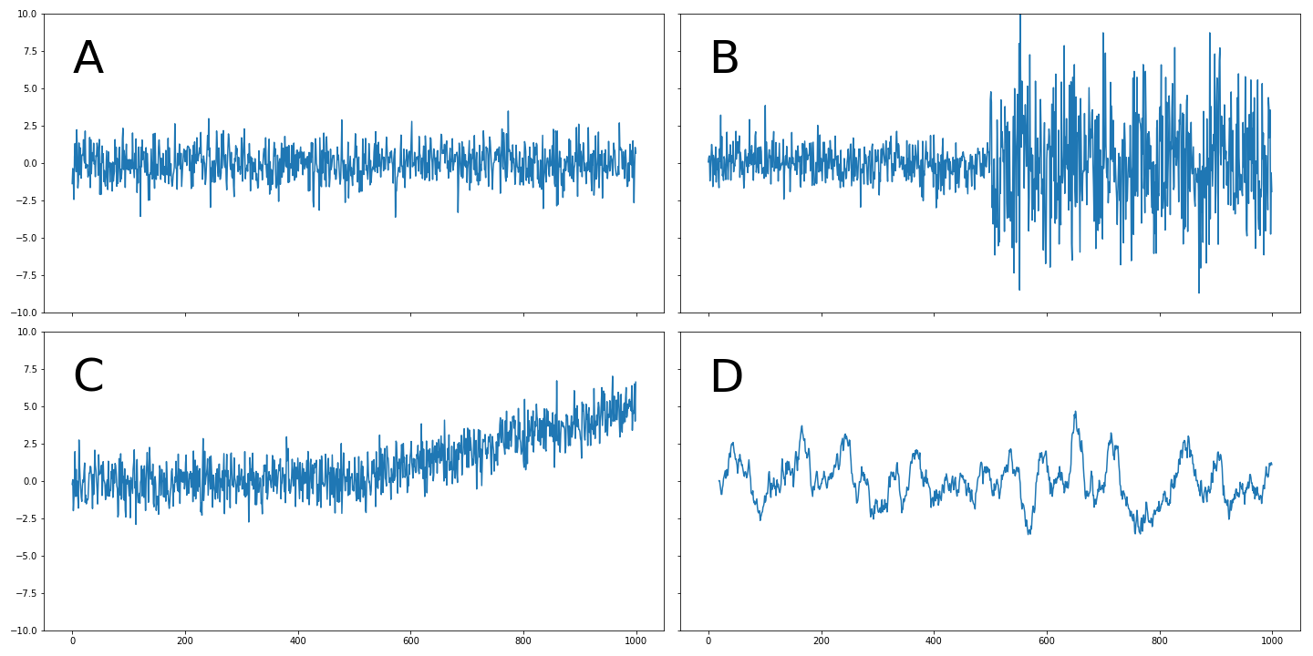
Which of the following time series do you think are not stationary?
Ans:B and C
C begins to trend upward partway through, while B shows a large increase in variance mid-way through, making both of them non-stationary.
Bootstrapping a confidence interval
A useful tool for assessing the variability of some data is the bootstrap. In this exercise, you'll write your own bootstrapping function that can be used to return a bootstrapped confidence interval.
This function takes three parameters:a 2-D array of numbers (data), a list of percentiles to calculate (percentiles), and the number of boostrap iterations to use (n_boots). It uses the resample function to generate a bootstrap sample, and then repeats this many times to calculate the confidence interval.
Instructions:
- The function should loop over the number of bootstraps (given by the parameter n_boots) and:
- Take a random sample of the data, with replacement, and calculate the mean of this random sample
- Compute the percentiles of bootstrap_means and return it
from sklearn.utils import resample
def bootstrap_interval(data, percentiles=(2.5, 97.5), n_boots=100):
"""Bootstrap a confidence interval for the mean of columns of a 2-D dataset."""
# Create empty array to fill the results
bootstrap_means = np.zeros([n_boots, data.shape[-1]])
for ii in range(n_boots):
# Generate random indices for data *with* replacement, then take the sample mean
random_sample = resample(data)
bootstrap_means[ii] = random_sample.mean(axis=0)
# Compute the percentiles of choice for the bootstrapped means
percentiles = np.percentile(bootstrap_means, percentiles, axis=0)
return percentiles
"""You can use this function to assess the variability of your model coefficients."""
Calculating variability in model coefficients
In this lesson, you'll re-run the cross-validation routine used before, but this time paying attention to the model's stability over time. You'll investigate the coefficients of the model, as well as the uncertainty in its predictions.
Begin by assessing the stability (or uncertainty) of a model's coefficients across multiple CV splits. Remember, the coefficients are a reflection of the pattern that your model has found in the data.
An instance of the Linear regression object (model) is available in your workpsace. Also, the arrays X and y (the data) are available too.
Instructions:
- Initialize a TimeSeriesSplit cross-validation object
- Create an array of all zeros to collect the coefficients.
- Iterate through splits of the cross-validation object. On each iteration:
- Fit the model on training data
- Collect the model's coefficients for analysis later
model = LinearRegression()
X_df = pd.read_csv('./datasets/chap4_X_stationarity.csv', index_col=[0])
y_df = pd.read_csv('./datasets/chap4_y_stationarity.csv', index_col=[0])
X, y = X_df.to_numpy(), y_df.to_numpy()
print(X.shape, y.shape)
n_splits = 100
cv = TimeSeriesSplit(n_splits=n_splits)
# Create empty array to collect coefficients
coefficients = np.zeros([n_splits, X.shape[1]])
for ii, (tr, tt) in enumerate(cv.split(X, y)):
# Fit the model on training data and collect the coefficients
model.fit(X[tr], y[tr])
coefficients[ii] = model.coef_
- Finally, calculate the 95% confidence interval for each coefficient in coefficients using the bootstrap_interval() function you defined in the previous exercise. You can run bootstrap_interval? if you want a refresher on the parameters that this function takes.
feature_names = ['AAPL_lag_1_day', 'YHOO_lag_1_day', 'NVDA_lag_1_day', 'AAPL_lag_2_day', 'YHOO_lag_2_day', 'NVDA_lag_2_day', 'AAPL_lag_3_day', 'YHOO_lag_3_day', 'NVDA_lag_3_day', 'AAPL_lag_4_day',
'YHOO_lag_4_day', 'NVDA_lag_4_day']
plt.style.use('ggplot')
mpl.rcParams['figure.dpi'] = 120
mpl.rcParams['figure.figsize'] = (7, 5)
bootstrapped_interval = bootstrap_interval(coefficients)
# Plot it
fig, ax = plt.subplots()
ax.scatter(feature_names, bootstrapped_interval[0], marker='_', lw=3)
ax.scatter(feature_names, bootstrapped_interval[1], marker='_', lw=3)
ax.set(title='95% confidence interval for model coefficients')
plt.setp(ax.get_xticklabels(), rotation=45, horizontalalignment='right')
plt.show()
"""You've calculated the variability around each coefficient, which helps assess which coefficients are more stable over time!"""

Visualizing model score variability over time
Now that you've assessed the variability of each coefficient, let's do the same for the performance (scores) of the model. Recall that the TimeSeriesSplit object will use successively-later indices for each test set. This means that you can treat the scores of your validation as a time series. You can visualize this over time in order to see how the model's performance changes over time.
An instance of the Linear regression model object is stored in model, a cross-validation object in cv, and data in X and y.
Instructions:
- Calculate the cross-validated scores of the model on the data (using a custom scorer we defined for you, my_pearsonr along with cross_val_score).
- Convert the output scores into a pandas Series so that you can treat it as a time series.
- Bootstrap a rolling confidence interval for the mean score using bootstrap_interval().
prices = pd.read_csv('./datasets/prices_aapl_yhoo_nvda.csv', index_col=[0])
prices_perc = prices.rolling(20).apply(percent_change)
shifts = np.arange(1, 5).astype(int)
# Use a dictionary comprehension to create name: value pairs, one pair per shift
shifted_data = {"{}_lag_{}_day".format(col,day_shift): prices_perc[col].shift(day_shift) for day_shift in shifts for col in prices_perc.columns}
# Convert into a DataFrame for subsequent use
prices_perc_shifted = pd.DataFrame(shifted_data)
display(prices_perc_shifted)
# y = prices_perc.fillna(np.nanmedian(prices_perc))
from functools import partial
model = LinearRegression()
X_df = pd.read_csv('./datasets/chap4_X_stationarity.csv', index_col=[0])
# I checked, then it turned out, they used a diffrent y dataset from the previous exercise.
y_df = pd.read_csv('./datasets/test_y.csv', index_col=[0])
X, y = X_df.to_numpy(), y_df.to_numpy()
print(X.shape, y.shape)
times_scores = pd.DatetimeIndex(
['2010-04-05', '2010-04-28', '2010-05-21', '2010-06-16', '2010-07-12','2010-08-04', '2010-08-27', '2010-09-22', '2010-10-15', '2010-11-09', '2010-12-03', '2010-12-29', '2011-01-24','2011-02-16', '2011-03-14', '2011-04-06', '2011-05-02', '2011-05-25', '2011-06-20', '2011-07-14', '2011-08-08', '2011-08-31', '2011-09-26', '2011-10-19', '2011-11-11', '2011-12-07','2012-01-03', '2012-01-27', '2012-02-22', '2012-03-16', '2012-04-11', '2012-05-04', '2012-05-30', '2012-06-22', '2012-07-18', '2012-08-10', '2012-09-05', '2012-09-28', '2012-10-23','2012-11-19', '2012-12-13', '2013-01-09', '2013-02-04', '2013-02-28', '2013-03-25', '2013-04-18', '2013-05-13', '2013-06-06', '2013-07-01', '2013-07-25', '2013-08-19', '2013-09-12','2013-10-07', '2013-10-30', '2013-11-22', '2013-12-18', '2014-01-14', '2014-02-07', '2014-03-05', '2014-03-28', '2014-04-23', '2014-05-16', '2014-06-11', '2014-07-07', '2014-07-30','2014-08-22', '2014-09-17', '2014-10-10', '2014-11-04', '2014-11-28', '2014-12-23', '2015-01-20', '2015-02-12', '2015-03-10', '2015-04-02', '2015-04-28', '2015-05-21', '2015-06-16','2015-07-10', '2015-08-04', '2015-08-27', '2015-09-22', '2015-10-15', '2015-11-09', '2015-12-03', '2015-12-29', '2016-01-25', '2016-02-18', '2016-03-14', '2016-04-07', '2016-05-02','2016-05-25', '2016-06-20', '2016-07-14', '2016-08-08', '2016-08-31', '2016-09-26', '2016-10-19', '2016-11-11', '2016-12-07'], dtype='datetime64[ns]', name='date', freq=None)
def my_pearsonr(est, X, y):
return np.corrcoef(est.predict(X).squeeze(), y.squeeze())[1, 0]
def bootstrap_interval(data, percentiles=(2.5, 97.5), n_boots=100):
"""Bootstrap a confidence interval for the mean of columns of a 1- or 2-D dataset."""
# Create our empty array we'll fille with the results
if data.ndim == 1:
data = np.array(data)[:, np.newaxis]
data = np.atleast_2d(data)
bootstrap_means = np.zeros([n_boots, data.shape[-1]])
for ii in range(n_boots):
# Generate random indices for our data *with* replacement, then take the sample mean
random_sample = resample(data)
bootstrap_means[ii] = random_sample.mean(axis=0)
# Compute the percentiles of choice for the bootstrapped means
percentiles = np.percentile(bootstrap_means, percentiles, axis=0)
return percentiles
plt.style.use('default')
mpl.rcParams['figure.dpi'] = 120
mpl.rcParams['figure.figsize'] = (12, 12)
from sklearn.model_selection import cross_val_score
from sklearn.linear_model import LinearRegression
from sklearn.model_selection import TimeSeriesSplit
model = LinearRegression()
# Iterate through CV splits
cv = TimeSeriesSplit(gap=0, max_train_size=None, n_splits=100, test_size=None)
# Generate scores for each split to see how the model performs over time
scores = cross_val_score(model, X, y, cv=cv, scoring=my_pearsonr)
scores
# Convert to a Pandas Series object
scores_series = pd.Series(scores, index=times_scores, name='score')
# Bootstrap a rolling confidence interval for the mean score
scores_lo = scores_series.rolling(20).aggregate(partial(bootstrap_interval, percentiles=2.5))
scores_hi = scores_series.rolling(20).aggregate(partial(bootstrap_interval, percentiles=97.5))
fig, ax = plt.subplots()
scores_lo.plot(ax=ax, label="Lower confidence interval")
scores_hi.plot(ax=ax, label="Upper confidence interval")
ax.legend()
plt.show()
"""You plotted a rolling confidence interval for scores over time. This is useful in seeing when your model predictions are correct."""

Accounting for non-stationarity
In this exercise, you will again visualize the variations in model scores, but now for data that changes its statistics over time.
An instance of the Linear regression model object is stored in model, a cross-validation object in cv, and the data in X and y.
Instructions:
- Create an empty DataFrame to collect the results.
- Iterate through multiple window sizes, each time creating a new TimeSeriesSplit object.
- Calculate the cross-validated scores (using a custom scorer we defined for you, my_pearsonr) of the model on training data.
from sklearn.model_selection import cross_val_score
from sklearn.linear_model import LinearRegression
from sklearn.model_selection import TimeSeriesSplit
model = LinearRegression()
X_df = pd.read_csv('./datasets/non_stationarity_X.csv', index_col=[0])
y_df = pd.read_csv('./datasets/non_stationarity_y.csv', index_col=[0])
X, y = X_df.to_numpy(), y_df.to_numpy()
window_sizes = [25, 50, 75, 100]
# Create an empty DataFrame to collect the stores
all_scores = pd.DataFrame(index=times_scores)
# Generate scores for each split to see how the model performs over time
for window in window_sizes:
# Create cross-validation object using a limited lookback window
cv = TimeSeriesSplit(n_splits=100, max_train_size=window)
# Calculate scores across all CV splits and collect them in a DataFrame
this_scores = cross_val_score(model, X, y, cv=cv, scoring=my_pearsonr)
all_scores['Length {}'.format(window)] = this_scores
ax = all_scores.rolling(10).mean().plot(cmap=plt.cm.coolwarm)
ax.set(title='Scores for multiple windows', ylabel='Correlation (r)')
plt.show()

Notice how in some stretches of time, longer windows perform worse than shorter ones. This is because the statistics in the data have changed, and the longer window is now using outdated information.