


ARIMA Models in Python
Learn to use the powerful ARIMA class models to forecast the future.
Download Datasets and Presentation slides for this post HERE
This post is 4th part of Time Series with Python Track from DataCamp. The track includes:
import pandas as pd
import numpy as np
import warnings
pd.set_option('display.expand_frame_repr', False)


import matplotlib as mpl
import matplotlib.pyplot as plt
plt.style.use('fivethirtyeight')
mpl.rcParams['figure.figsize'] = (16, 16)
mpl.rcParams['axes.grid'] = True


warnings.filterwarnings("ignore")
Have you ever tried to predict the future? What lies ahead is a mystery which is usually only solved by waiting. In this course, you will stop waiting and learn to use the powerful ARIMA class models to forecast the future. You will learn how to use the statsmodels package to analyze time series, to build tailored models, and to forecast under uncertainty. How will the stock market move in the next 24 hours? How will the levels of CO2 change in the next decade? How many earthquakes will there be next year? You will learn to solve all these problems and more.
ARMA Models
Dive straight in and learn about the most important properties of time series. You'll learn about stationarity and how this is important for ARMA models. You'll learn how to test for stationarity by eye and with a standard statistical test. Finally, you'll learn the basic structure of ARMA models and use this to generate some ARMA data and fit an ARMA model.
Intro to time series and stationarity
Exploration
You may make plots regularly, but in this course, it is important that you can explicitly control which axis different time series are plotted on. This will be important so you can evaluate your time series predictions later.
Here your task is to plot a dataset of monthly US candy production between 1972 and 2018.
Specifically, you are plotting the industrial production index IPG3113N. This is total amount of sugar and confectionery products produced in the USA per month, as a percentage of the January 2012 production. So 120 would be 120% of the January 2012 industrial production.
Check out how this quantity has changed over time and how it changes throughout the year.
Instructions:
- Import matplotlib.pyplot giving it the alias plt and import pandas giving it the alias pd.
- Load in the candy production time series 'candy_production.csv' using pandas, set the index to the'date'column, parse the dates and assign it to the variable candy.
- Plot the time series onto the axis ax1 using the DataFrame's .plot() method. Then show the plot.
import pandas as pd
import matplotlib.pyplot as plt

# Load in the time series
candy = pd.read_csv('./datasets/candy_production.csv', index_col='date', parse_dates=True)

# Plot and show the time series on axis ax1
fig, ax1 = plt.subplots()
candy.plot(ax=ax1)
plt.show()

This plotting method will be invaluable later when plotting multiple things on the same axis! Can you tell whether this is a stationary time series or not? How does it change throughout the years?
Train-test splits
In this exercise you are going to take the candy production dataset and split it into a train and a test set. Like you understood in the video exercise, the reason to do this is so that you can test the quality of your model fit when you are done.
The candy production data set has been loaded in for you as candy already and pyplot has been loaded in as plt.
Instructions:
- Split the time series into train and test sets by slicing with datetime indexes. Take the train set as everything up to the end of 2006 and the test set as everything from the start of 2007.
- Make a pyplot axes using the subplots() function.
- Use the DataFrame's .plot() method to plot the train and test sets on the axis ax.
candy_train = candy.loc[:'2006']
candy_test = candy.loc['2007':]

# Create an axis
fig, ax = plt.subplots()

# Plot the train and test sets on the axis ax
candy_train.plot(ax=ax)
candy_test.plot(ax=ax)
plt.show()

Take a look at the plot, do you think that you yourself could predict what happens after 2006 given the blue training set. What happens to the long term trend and the seasonal pattern?
Is it stationary
Identifying whether a time series is stationary or non-stationary is very important. If it is stationary you can use ARMA models to predict the next values of the time series. If it is non-stationary then you cannot use ARMA models, however, as you will see in the next lesson, you can often transform non-stationary time series to stationary ones.
In this exercise you will examine some stock and earthquake data sets in order to identify which are ready for ARMA modeling, and which will need further work to make them stationary.

The top plot shown is a time series of Amazon stock close price. Is the stock close price stationary?
Ans: No, because the top plot has a trend.
The middle plot shown is a time series of the return (percentage increase of price per day) of Amazon stock. Is the stock return stationary?
Ans: No, because in the middle plot, the variance changes with time.
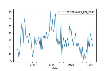
The bottom plot is a time series of the number of major earthquakes per year (earthquakes of magnitude 7.0 or greater). Is the number of major earthquakes per year stationary?
Ans: Yes, the bottom plot appears to be stationary.
You can't see any trend, or any obvious changes in variance, or dynamics. This time series looks stationary.
Augmented Dicky-Fuller
In this exercise you will run the augmented Dicky-Fuller test on the earthquakes time series to test for stationarity. You plotted this time series in the last exercise. It looked like it could be stationary, but earthquakes are very damaging. If you want to make predictions about them you better be sure.
Remember that if it were not stationary this would mean that the number of earthquakes per year has a trend and is changing. This would be terrible news if it is trending upwards, as it means more damage. It would also be terrible news if it were trending downwards, it might suggest the core of our planet is changing and this could have lots of knock on effects for us!
The earthquakes DataFrame has been loaded in for you as earthquake.
Instructions:
- Import the augmented Dicky-Fuller function adfuller() from statsmodels.
- Run the adfuller() function on the 'earthquakes_per_year' column of the earthquake DataFrame and assign the result to result.
- Print the test statistic, the p-value and the critical values.
earthquake = pd.read_csv('./datasets/earthquakes.csv', usecols=['date', 'earthquakes_per_year'], parse_dates=['date'])
display(earthquake.head())
from statsmodels.tsa.stattools import adfuller

# Run test
result = adfuller(earthquake['earthquakes_per_year'])

# Print test statistic
print(result[0])

# Print p-value
print(result[1])

# Print critical values
print(result[4])
Earth shaking effort! You can reject the null hypothesis that the time series is non-stationary. Therefore it is stationary. You probably could have intuited this from looking at the graph or by knowing a little about geology. The time series covers only about 100 years which is a very short time on a geological time scale.
Taking the difference
In this exercise, you will to prepare a time series of the population of a city for modeling. If you could predict the growth rate of a city then it would be possible to plan and build the infrastructure that the city will need later, thus future-proofing public spending. In this case the time series is fictitious but its perfect to practice on.
You will test for stationarity by eye and use the Augmented Dicky-Fuller test, and take the difference to make the dataset stationary.
The DataFrame of the time series has been loaded in for you as city and the adfuller() function has been imported.
Instructions:
- Run the augmented Dicky-Fuller on the 'city_population' column of city.
- Print the test statistic and the p-value.
- Take the first difference of city dropping the NaN values. Assign this to city_stationary and run the test again.
- Take the second difference of city, by applying the .diff() method twice and drop the NaN values.
city = pd.read_csv('./datasets/city.csv', parse_dates=['date'], index_col=['date'])
city.head()
city.info()
result = adfuller(city['city_population'])

# Plot the time series
fig, ax = plt.subplots()
city.plot(ax=ax)
plt.show()

# Print the test statistic and the p-value
print('ADF Statistic:', result[0])
print('p-value:', result[1])

Other tranforms
Differencing should be the first transform you try to make a time series stationary. But sometimes it isn't the best option.
A classic way of transforming stock time series is the log-return of the series. This is calculated as follows:$$ \text{log\_return}(y_t) = \log \big(\frac{y_t}{y_{t-1}}\big) $$ You can calculate the log-return of this DataFrame by substituting:
$y_t$ → amazon
$y_{t-1}$ → amazon.shift(1)
$\log()$ → np.log()
In this exercise you will compare the log-return transform and the first order difference of the Amazon stock time series to find which is better for making the time series stationary.
amazon = pd.read_csv('./datasets/amazon_close.csv', index_col='date', parse_dates=True)
amazon.head()
- Calculate the first difference of the time series amazon to test for stationarity and drop the NaNs.
amazon_diff = amazon.diff()
amazon_diff = amazon_diff.dropna()

# Run test and print
result_diff = adfuller(amazon_diff['close'])
print(result_diff)
- Calculate the log return on the stocks time series amazon to test for stationarity.
amazon_diff = amazon.diff()
amazon_diff = amazon_diff.dropna()

# Run test and print
result_diff = adfuller(amazon_diff['close'])
print(result_diff)

# Calculate log-return and drop nans
amazon_log = np.log(amazon.div(amazon.shift(1)))
amazon_log = amazon_log.dropna()

# Run test and print
result_log = adfuller(amazon_log['close'])
print(result_log)
Notice that both the differenced and the log-return transformed time series have a small p-value, but the log transformed time series has a much more negative test statistic. This means the log-return tranformation is better.
Model order
When fitting and working with AR, MA and ARMA models it is very important to understand the model order. You will need to pick the model order when fitting. Picking this correctly will give you a better fitting model which makes better predictions. So in this section you will practice working with model order.
Instructions:
Print ar_coefs and ma_coefs which are available in the console. If you were to use these in the arma_generate_sample() function what would be the order of the data?
python:
  print(ar_coefs)
  [1, 0.4, -0.1]

  print(ma_coefs)
  [1, 0.2]
Ans: ARMA(2,1)
Print ar_coefs and ma_coefs which are available in the console. If you were to use these in the arma_generate_sample() function what would the lag-1 AR coefficient?
Ans: -0.4
Which of these models is equivalent to an AR(1) model?
Ans: ARMA(1,0)
Note that setting either p or q to zero means we get a simpler model, either a AR or MA model.
Generating ARMA data
In this exercise you will generate 100 days worth of AR/MA/ARMA data. Remember that in the real world applications, this data could be changes in Google stock prices, the energy requirements of New York City, or the number of cases of flu.
You can use the arma_generate_sample() function available in your workspace to generate time series using different AR and MA coefficients.
Remember for any model ARMA(p,q):
- The list ar_coefs has the form [1, -a_1, -a_2, ..., -a_p].
- The list ma_coefs has the form [1, m_1, m_2, ..., m_q],
where a_i are the lag-i AR coefficients and m_j are the lag-j MA coefficients.
Instructions:
- Set ar_coefs and ma_coefs for an MA(1) model with MA lag-1 coefficient of -0.7.
- Generate a time series of 100 values.
- Set the coefficients for an AR(2) model with AR lag-1 and lag-2 coefficients of 0.3 and 0.2 respectively.
- Set the coefficients for a model with form $ y_t = -0.2 y_{t-1} + 0.3 \epsilon_{t-1} + 0.4 \epsilon_{t-2} + \epsilon_{t}$
from statsmodels.tsa.arima_process import arma_generate_sample
np.random.seed(1)

# Set coefficients
ar_coefs = [1]
ma_coefs = [1, -0.7]

# Generate data
y = arma_generate_sample(ar_coefs, ma_coefs, nsample=100, scale=0.5)

plt.plot(y)
plt.ylabel(r'$y_t$')
plt.xlabel(r'$t$')
plt.show()

You can use this data to check our code. If you can recover these same coefficients when you fit a model, then you will know your methods work!
Fitting Prelude
Great, you understand model order! Understanding the order is important when it comes to fitting models. You will always need to select the order of model you fit to your data, no matter what that data is.
In this exercise you will do some basic fitting. Fitting models is the next key step towards making predictions. We'll go into this more in the next chapter but let's get a head start.
Some example ARMA(1,1) data have been created and are available in your environment as y. This data could represent the amount of traffic congestion. You could use forecasts of this to suggest the efficient routes for drivers.
Instructions:
- Import the ARMA model class from the statsmodels.tsa.arima_model submodule.
- Create a model object, passing it the time series y and the model order (1,1). Assign this to the variable model.
- Use the model's .fit() method to fit to the data.
CODE:
# Import the ARMA model
from statsmodels.tsa.arima_model import ARMA

# Instantiate the model
model = ARMA(y, order=(1, 1))

# Fit the model
results = model.fit()
Fitting AR and MA models
In this exercise you will fit an AR and an MA model to some data. The data here has been generated using the arma_generate_sample() function we used before.
You know the real AR and MA parameters used to create this data so it is a really good way to gain some confidence with ARMA models and know you are doing it right. In the next exercise you'll move onto some real world data with confidence.
There is a pandas DataFrame available in your environment called sample. It has two columns of different time series data.
Instructions:
Using the information in the summary printed, which of the following set of parameters do you think was used to generate the 'timeseries_1' data?
Possible Answers
ar_coefs = [0.9, 0.3],
ma_coefs = [1]ar_coefs = [1] ,
ma_coefs = [1, -0.9, 0.3]ar_coefs = [1, -0.9, 0.3],
ma_coefs = [1]ar_coefs = [1, 0.9, -0.3],
ma_coefs = [1]
Previous Code Version:
from statsmodels.tsa.arima_model import ARMA

# Instantiate the model
model = ARMA(sample['timeseries_1'], order=(2, 0))

# Fit the model
results = model.fit()

# Print summary
print(results.summary())
sample = pd.read_csv('./datasets/sample.csv', index_col=0)
sample.head()
from statsmodels.tsa.arima.model import ARIMA

# Instantiate the model
model = ARIMA(sample['timeseries_1'], order=(2, 0, 0))

# Fit the model
results = model.fit()

# Print summary
print(results.summary())
- Fit an MA(3) model to the 'timeseries_2' column of sample.
model = ARMA(sample['timeseries_2'], order=(0, 3))

# Fit the model
results = model.fit()

# Print summary
print(results.summary())
model = ARIMA(sample['timeseries_2'], order=(0, 0, 3))

# Fit the model
results = model.fit()

# Print summary
print(results.summary())
Using the information in the summary printed, which of the following set of parameters do you think was used to generate the 'timeseries_2' data?
ar_coefs = [],
ma_coefs = [0.2, 0.6, 0.1]ar_coefs = [1],
ma_coefs = [1, 0.2, 0.6, -0.1]ar_coefs = [1, 0.2, 0.6, -0.1], ma_coefs = [1]
ar_coefs = [1], ma_coefs = [1, -0.2, -0.6, 0.1]
The fitted models had very similar AR and MA coefficient values to the real ones! You know it works!
Fitting an ARMA model
In this exercise you will fit an ARMA model to the earthquakes dataset. You saw before that the earthquakes dataset is stationary so you don't need to transform it at all. It comes ready for modeling straight out the ground. You can remind yourself what it looks like below.
The earthquakes dataset is available in your environment as earthquake. The ARMA class is also available in your environment.
Instructions:
- Instantiate an ARMA(3,1) model and pass it the earthquakes dataset.
- Fit the model.
- Print the summary of the model fit.
Previous version Code:
# Instantiate the model
model = ARMA(earthquake['earthquakes_per_year'], order=(3, 1))

# Fit the model
results = model.fit()

# Print model fit summary
print(results.summary())
model = ARIMA(earthquake['earthquakes_per_year'], order=(3, 0 ,1))

# Fit the model
results = model.fit()

# Print model fit summary
print(results.summary())
Fitting an ARMAX model
In this exercise you will fit an ARMAX model to a time series which represents the wait times at an accident and emergency room for urgent medical care.
The variable you would like to model is the wait times to be seen by a medical professional wait_times_hrs. This may be related to an exogenous variable that you measured nurse_count which is the number of nurses on shift at any given time. These can be seen below.
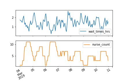
This is a particularly interesting case of time series modeling as, if the number of nurses has an effect, you could change this to affect the wait times.
The time series data is available in your environment as hospital and has the two columns mentioned above. The ARMA class is also available for you.
Instructions:
- Instantiate an ARMAX(2,1) model to train on the 'wait_times_hrs' column of hospital using the 'nurse_count' column as an exogenous variable.
- Fit the model.
- Print the summary of the model fit.
hospital = pd.read_csv('./datasets/hospital.csv', index_col=0, parse_dates=True)
hospital.head()
hospital.plot(subplots=True)

model = ARIMA(hospital['wait_times_hrs'], order=(2, 0, 1), exog=hospital['nurse_count'])

# Fit the model
results = model.fit()

# Print model fit summary
print(results.summary())
Look back at the model parameters. What is the relation between the number of nurses on shift and the wait times? If you predicted that tomorrow was going to have long wait times how could you combat this?
Generating one-step-ahead predictions
It is very hard to forecast stock prices. Classic economics actually tells us that this should be impossible because of market clearing.
Your task in this exercise is to attempt the impossible and predict the Amazon stock price anyway.
In this exercise you will generate one-step-ahead predictions for the stock price as well as the uncertainty of these predictions.
A model has already been fitted to the Amazon data for you. The results object from this model is available in your environment as results.
Instructions:
- Use the results object to make one-step-ahead predictions over the latest 30 days of data and assign the result to one_step_forecast.
- Assign your mean predictions to mean_forecast using one of the attributes of the one_step_forecast object.
- Extract the confidence intervals of your predictions from the one_step_forecast object and assign them to confidence_intervals.
- Print your mean predictions.
amazon = pd.read_csv('./datasets/amazon_close.csv', parse_dates=True, index_col='date')
amazon = amazon.iloc[::-1]
from statsmodels.tsa.statespace.sarimax import SARIMAX

model = SARIMAX(amazon.loc['2018-01-01':'2019-02-08'], order=(3, 1, 3), seasonal_order=(1, 0, 1, 7),
                enforce_invertibility=False,
                enforce_stationarity=False,
                simple_differencing=False,
                measurement_error=False,
                k_trend=0)
results = model.fit()
results.summary()
one_step_forecast = results.get_prediction(start=-30)

# Extract prediction mean
mean_forecast = one_step_forecast.predicted_mean

# Get confidence intervals of predictions
confidence_intervals = one_step_forecast.conf_int()

# Select lower and upper confidence limits
lower_limits = confidence_intervals.loc[:,'lower close']
upper_limits = confidence_intervals.loc[:,'upper close']

# Print best estimate  predictions
print(mean_forecast.values)
The predictions told me you could do it! You can use theis one-step-ahead forecast to estimate what your error would be, if you were to make a prediction for the Amazon stock price of tomorrow.
Plotting one-step-ahead predictions
Now that you have your predictions on the Amazon stock, you should plot these predictions to see how you've done.
You made predictions over the latest 30 days of data available, always forecasting just one day ahead. By evaluating these predictions you can judge how the model performs in making predictions for just the next day, where you don't know the answer.
The lower_limits, upper_limits and amazon DataFrames as well as your mean prediction mean_forecast that you created in the last exercise are available in your environment.
Instructions:
- Plot the amazon data, using the amazon.index as the x coordinates.
- Plot the mean_forecast prediction similarly, using mean_forecast.index as the x-coordinates.
- Plot a shaded area between lower_limits and upper_limits of your confidence interval. Use the index of lower_limits as the x coordinates.
plt.plot(amazon.index, amazon['close'], label='observed')

# Plot your mean predictions
plt.plot(mean_forecast.index, mean_forecast, color='r', label='forecast')

# shade the area between your confidence limits
plt.fill_between(lower_limits.index, lower_limits, upper_limits, color='pink')

# set labels, legends and show plot
plt.xlabel('Date')
plt.ylabel('Amazon Stock Price - Close USD')
plt.legend()
plt.show()

Have a look at your plotted forecast. Is the mean prediction close to the observed values? Do the observed values lie between the upper and lower limits of your prediction?
Generating dynamic forecasts
Now lets move a little further into the future, to dynamic predictions. What if you wanted to predict the Amazon stock price, not just for tomorrow, but for next week or next month? This is where dynamical predictions come in.
Remember that in the video you learned how it is more difficult to make precise long-term forecasts because the shock terms add up. The further into the future the predictions go, the more uncertain. This is especially true with stock data and so you will likely find that your predictions in this exercise are not as precise as those in the last exercise.
Instructions:
- Use the results object to make a dynamic predictions for the latest 30 days and assign the result to dynamic_forecast.
- Assign your predictions to a new variable called mean_forecast using one of the attributes of the dynamic_forecast object.
- Extract the confidence intervals of your predictions from the dynamic_forecast object and assign them to a new variable confidence_intervals.
- Print your mean predictions.
dynamic_forecast = results.get_prediction(start=-30, dynamic=True)

# Extract prediction mean
mean_forecast = dynamic_forecast.predicted_mean

# Get confidence intervals of predictions
confidence_intervals = dynamic_forecast.conf_int()

# Select lower and upper confidence limits
lower_limits = confidence_intervals.loc[:, 'lower close']
upper_limits = confidence_intervals.loc[:, 'upper close']

# Print bet estimate predictions
print(mean_forecast.values)
Plotting dynamic forecasts
Time to plot your predictions. Remember that making dynamic predictions, means that your model makes predictions with no corrections, unlike the one-step-ahead predictions. This is kind of like making a forecast now for the next 30 days, and then waiting to see what happens before comparing how good your predictions were.
The lower_limits, upper_limits and amazon DataFrames as well as your mean predictions mean_forecast that you created in the last exercise are available in your environment.
Instructions:
- Plot the amazon data using the dates in the index of this DataFrame as the x coordinates and the values as the y coordinates.
- Plot the mean_forecast predictions similarly.
- Plot a shaded area between lower_limits and upper_limits of your confidence interval. Use the index of one of these DataFrames as the x coordinates.
amazon = amazon.loc['2017-12':]
amazon.head()
plt.plot(amazon.index, amazon['close'], label='observed')

# Plot your mean forecast
plt.plot(mean_forecast.index, mean_forecast, label='forecast')

# Shade the area between your confidence limits
plt.fill_between(lower_limits.index, lower_limits, upper_limits, color='pink')

# set labels, legends and show plot
plt.xlabel('Date')
plt.ylabel('Amazon Stock Price - Close USD')
plt.legend()
plt.show()

It is very hard to predict stock market performance and so your predictions have a wide uncertainty. However, note that the real stock data stayed within your uncertainty limits!
Differencing and fitting ARMA
In this exercise you will fit an ARMA model to the Amazon stocks dataset. As you saw before, this is a non-stationary dataset. You will use differencing to make it stationary so that you can fit an ARMA model.
In the next section you'll make a forecast of the differences and use this to forecast the actual values.
The Amazon stock time series in available in your environment as amazon. The SARIMAX model class is also available in your environment.
Instructions:
- Use the .diff() method of amazon to make the time series stationary by taking the first difference. Don't forget to drop the NaN values using the .dropna() method.
- Create an ARMA(2,2) model using the SARIMAX class, passing it the stationary data.
- Fit the model.
amazon = pd.read_csv('./datasets/amazon_close.csv', parse_dates=True, index_col='date')
display(amazon.head())
amazon.sort_index(inplace=True)
display(amazon.head())
amazon_diff = amazon.diff().dropna()

# Create ARMA(2, 2) model
arma = SARIMAX(amazon_diff, order=(2, 0, 2))

# Fit model
arma_results = arma.fit()

# Print fit summary
print(arma_results.summary())
Unrolling ARMA forecast
Now you will use the model that you trained in the previous exercise arma in order to forecast the absolute value of the Amazon stocks dataset. Remember that sometimes predicting the difference could be enough; will the stocks go up, or down; but sometimes the absolute value is key.
The results object from the model you trained in the last exercise is available in your environment as arma_results. The np.cumsum() function and the original DataFrame amazon are also available.
Instructions:
- Use the .get_forecast() method of the arma_results object and select the predicted mean of the next 10 differences.
- Use the np.cumsum() function to integrate your difference forecast.
- Add the last value of the original DataFrame to make your forecast an absolute value.
arma_diff_forecast = arma_results.get_forecast(steps=10).predicted_mean

# Integrate the difference forecast
arma_int_forecast = np.cumsum(arma_diff_forecast)

# Make absolute value forecast
arma_value_forecast = arma_int_forecast + amazon.iloc[-1, 0]

# Print forecast
print(arma_value_forecast)
You have just made an ARIMA forecast the hard way. Next you'll use statsmodels to make things easier.
Fitting an ARIMA model
In this exercise you'll learn how to be lazy in time series modeling. Instead of taking the difference, modeling the difference and then integrating, you're just going to lets statsmodels do the hard work for you.
You'll repeat the same exercise that you did before, of forecasting the absolute values of the Amazon stocks dataset, but this time with an ARIMA model.
A subset of the stocks dataset is available in your environment as amazon and so is the SARIMAX model class.
Instructions:
- Create an ARIMA(2,1,2) model, using the SARIMAX class, passing it the Amazon stocks data amazon.
- Fit the model.
- Make a forecast of mean values of the Amazon data for the next 10 time steps. Assign the result to arima_value_forecast.
arima = SARIMAX(amazon, order=(2, 1, 2))

# Fit ARIMA model
arima_results = arima.fit()

# Make ARIMA forecast of next 10 values
arima_value_forecast = arima_results.get_forecast(steps=10).predicted_mean

# Print forecast
print(arima_value_forecast)
You just made the same forecast you made before, but this time with an ARIMA model. Your two forecasts give the same results, but the ARIMA forecast was a lot easier to code!
Choosing ARIMA model
The Best of the Best Models
In this chapter, you will become a modeler of discerning taste. You'll learn how to identify promising model orders from the data itself, then, once the most promising models have been trained, you'll learn how to choose the best model from this fitted selection. You'll also learn a great framework for structuring your time series projects.
AR or MA
In this exercise you will use the ACF and PACF to decide whether some data is best suited to an MA model or an AR model. Remember that selecting the right model order is of great importance to our predictions.
Remember that for different types of models we expect the following behavior in the ACF and PACF:
| AR(p) | MA(q) | ARMA(p,q) | |
|---|---|---|---|
| ACF | Tails off | Cuts off after lag q | Tails off |
| PACF | Cuts off after lag p | Tails off | Tails off |
A time series with unknown properties, df is available for you in your environment.
Instructions:
- Import the plot_acf and plot_pacf functions from statsmodels.
- Plot the ACF and the PACF for the series df for the first 10 lags but not the zeroth lag.
df = pd.read_csv('./datasets/download.csv', parse_dates=True, index_col=[0])
df = df.asfreq('d')
df.info()
df.head()
from statsmodels.graphics.tsaplots import plot_acf, plot_pacf

# Create figure
fig, (ax1, ax2) = plt.subplots(2, 1, figsize=(12,12))

# Plot the ACF of df
plot_acf(df, lags=10, zero=False, ax=ax1, auto_ylims=True)

# Plot the PACF of df
plot_pacf(df, lags=10, zero=False, ax=ax2, auto_ylims=True)

plt.show()

Based on the ACF and PACF plots, what kind of model is this?
Ans: MA(3)
The ACF cuts off after 3 lags and the PACF tails off.
Order of earthquakes
In this exercise you will use the ACF and PACF plots to decide on the most appropriate order to forecast the earthquakes time series.
| AR(p) | MA(q) | ARMA(p,q) | |
|---|---|---|---|
| ACF | Tails off | Cuts off after lag q | Tails off |
| PACF | Cuts off after lag p | Tails off | Tails off |
The earthquakes time series earthquake, the plot_acf(), and plot_pacf() functions, and the SARIMAX model class are available in your environment.
Instructions:
- Plot the ACF and the PACF of the earthquakes time series earthquake up to a lag of 15 steps and don't plot the zeroth lag.
earthquake = pd.read_csv('./datasets/earthquakes.csv', usecols=['date', 'earthquakes_per_year'], parse_dates=['date'], index_col=[0])
display(earthquake.head())
display(earthquake.info())
fig, (ax1, ax2) = plt.subplots(2,1, figsize=(12,12))

# Plot ACF and PACF
plot_acf(earthquake, lags=15, zero=False, ax=ax1, auto_ylims=True)
plot_pacf(earthquake, lags=15, zero=False, ax=ax2, auto_ylims=True)

# Show plot
plt.show()

Look at the ACF/PACF plots and the table above.
What is the most appropriate model for the earthquake data?
Ans: AR(1)
- Create and train a model object for the earthquakes time series.
from statsmodels.tsa.statespace.sarimax import SARIMAX
# Create figure
fig, (ax1, ax2) = plt.subplots(2,1, figsize=(12,8))

# Plot ACF and PACF
plot_acf(earthquake, lags=10, zero=False, ax=ax1)
plot_pacf(earthquake, lags=10, zero=False, ax=ax2)

# Show plot
plt.show()

# Instantiate model
model = SARIMAX(earthquake, order=(1, 0, 0))

# Train model
results = model.fit()

Searching over model order
In this exercise you are faced with a dataset which appears to be an ARMA model. You can see the ACF and PACF in the plot below. In order to choose the best order for this model you are going to have to do a search over lots of potential model orders to find the best set.
![]()
The SARIMAX model class and the time series DataFrame df are available in your environment.
Instructions:
- Loop over values of p from 0-2.
- Loop over values of q from 0-2.
- Train and fit an ARMA(p,q) model.
- Append a tuple of (p,q, AIC value, BIC value) to order_aic_bic.
df = pd.read_csv('./datasets/df_500.csv', parse_dates=True, index_col=[0])
df = df.asfreq('d')
df.info()
order_aic_bic=[]

# Loop over p values from 0-2
for p in range(3):
    # Loop over q values from 0-2
    for q in range(3):
        # Create and fit ARMA(p, q) model
        model = SARIMAX(df, order=(p, 0, q))
        results = model.fit()

        # Append order and results tuple
        order_aic_bic.append((p, q, results.aic, results.bic))
You built 9 models in just a few seconds! In the next exercise you will evaluate the results to choose the best model.
Choosing order with AIC and BIC
Now that you have performed a search over many model orders, you will evaluate your results to find the best model order.
The list of tuples of (p,q, AIC value, BIC value) that you created in the last exercise, order_aic_bic, is available in your environment. pandas has also been imported as pd.
Instructions:
- Create a DataFrame to hold the order search information in the order_aic_bic list. Give it the column names ['p', 'q', 'AIC', 'BIC'].
- Print the DataFrame in order of increasing AIC and then BIC.
order_df = pd.DataFrame(order_aic_bic, columns=['p', 'q', 'AIC', 'BIC'])

# Print order_df in order of increasing AIC
print(order_df.sort_values('AIC'))

# Print order_df in order of increasing BIC
print(order_df.sort_values('BIC'))
Which of the following models is the best fit?
Answer: ARMA(2,1)
This time AIC and BIC favored the same model, but this won't always be the case.
AIC and BIC vs ACF and PACF
In this exercise you will apply an AIC-BIC order search for the earthquakes time series. In the last lesson you decided that this dataset looked like an AR(1) process. You will do a grid search over parameters to see if you get the same results. The ACF and PACF plots for this dataset are shown below.

The SARIMAX model class and the time series DataFrame earthquake are available in your environment.
Instructions:
- Loop over orders of p and q between 0 and 2.
- Inside the loop try to fit an ARMA(p,q) to earthquake on each loop.
- Print p and q alongside AIC and BIC in each loop.
- If the model fitting procedure fails print p, q, None, None.
for p in range(3):
    for q in range(3):
        try:
            # Create and fit ARMA(p, q) model
            model = SARIMAX(earthquake, order=(p, 0, q))
            results = model.fit()

            # Print order and results
            print(p, q, results.aic, results.bic)

        except:
            print(p, q, None, None)
Super! If you look at your printed results you will see that the AIC and BIC both actually favor an ARMA(1,1) model. This isn't what you predicted from the ACF and PACF but notice that the lag 2-3 PACF values are very close to significant, so the ACF/PACF are close to those of an ARMA(p,q) model.
Mean absolute error
Obviously, before you use the model to predict, you want to know how accurate your predictions are. The mean absolute error (MAE) is a good statistic for this. It is the mean difference between your predictions and the true values.
In this exercise you will calculate the MAE for an ARMA(1,1) model fit to the earthquakes time series
numpy has been imported into your environment as np and the earthquakes time series is available for you as earthquake.
Instructions:
- Use np functions to calculate the Mean Absolute Error (MAE) of the .resid attribute of the results object.
- Print the MAE.
- Use the DataFrame's .plot() method with no arguments to plot the earthquake time series.
model = SARIMAX(earthquake, order=(1, 0, 1))
results = model.fit()

# Calculate the mean absolute error from residuals
mae = np.mean(np.abs(results.resid))

# Print mean absolute error
print(mae)

# Make plot of time series for comparison
earthquake.plot()
plt.show()

Great! Your mean error is about 4-5 earthquakes per year. You have plotted the time series so that you can see how the MAE compares to the spread of the time series. Considering that there are about 20 earthquakes per year that is not too bad.
Diagnostic summary statistics
It is important to know when you need to go back to the drawing board in model design. In this exercise you will use the residual test statistics in the results summary to decide whether a model is a good fit to a time series.
Here is a reminder of the tests in the model summary:
| Test | Null hypothesis | P-value name |
|---|---|---|
| Ljung-Box | There are no correlations in the residual | Prob(Q) |
| Jarque-Bera | The residuals are normally distributed | Prob(JB) |
An unknown time series df and the SARIMAX model class are available for you in your environment.
Instructions:
- Fit an ARMA(3,1) model to the time series df.
- Print the model summary.
df = pd.read_csv('./datasets/df_400.csv', parse_dates=True, index_col=[0])
df = df.asfreq('d')
df.info()
model1 = SARIMAX(df, order=(3, 0, 1))
results1 = model1.fit()

# Print summary
print(results1.summary())
Based on the outcomes of the tests in the summary, which of the following is correct about the residuals of results1?
Answer: They are not correlated and are normally distributed.
- Fit an AR(2) model to the time series df.
- Print the model summary.
model2 = SARIMAX(df, order=(2, 0, 0))
results2 = model2.fit()

# Print summary
print(results2.summary())
Based on the outcomes of the tests in the summary, which of the following is correct about the residuals of results2?
Answer: They are correlated and are normally distributed.
Our model didn't pull out all the correlations in the data. This suggests we could make it better. Perhaps by increasing the model order.
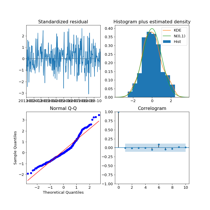
Plot diagnostics
It is important to know when you need to go back to the drawing board in model design. In this exercise you will use 4 common plots to decide whether a model is a good fit to some data.
Here is a reminder of what you would like to see in each of the plots for a model that fits well:
| Test | Good fit |
|-----------------------------|-------------------------------------------------------------------------|
| Standardized residual | There are no obvious patterns in the residuals |
| Histogram plus kde estimate | The KDE curve should be very similar to the normal distribution |
| Normal Q-Q | Most of the data points should lie on the straight line |
| Correlogram | 95% of correlations for lag greater than zero should not be significant |
An unknown time series df and the SARIMAX model class are available for you in your environment.
Instructions:
- Fit an ARIMA(1,1,1) model to the time series df.
- Create the 4 diagnostic plots.s.
df = pd.read_csv('./datasets/df_300.csv', parse_dates=True, index_col=[0])
df = df.asfreq('d')
df.info()
model = SARIMAX(df, order=(1, 1, 1))
results=model.fit()

# Create the 4 diagostics plots
results.plot_diagnostics(figsize=(20, 15))
plt.show()

Do these plots suggest that any of these are true about the model fit.
Answer: None of the above.
Below are 4 different diagnostic plots, each of the 4 plots comes from a different fitted model.
Which of the plots above suggest that the fitted model could be improved?
Answer: Normal Q-Q.
The Q-Q plot deviates significantly from a straight line! This suggests the model could be improved.
Identification
In the following exercises you will apply to the Box-Jenkins methodology to go from an unknown dataset to a model which is ready to make forecasts.
You will be using a new time series. This is the personal savings as % of disposable income 1955-1979 in the US.
The first step of the Box-Jenkins methodology is Identification. In this exercise you will use the tools at your disposal to test whether this new time series is stationary.
The time series has been loaded in as a DataFrame savings and the adfuller() function has been imported.
Instructions:
- Plot the time series using the DataFrame's .plot() method.
- Apply the Dicky-Fuller test to the 'savings' column of the savings DataFrame and assign the test outcome to result.
- Print the Dicky-Fuller test statistics and the associated p-value.
from statsmodels.tsa.stattools import adfuller

savings = pd.read_csv('./datasets/savings.csv', parse_dates=True, index_col=[0])
savings.info()
# Plot time series
savings.plot()
plt.show()

# Run Dicky-Fuller test
result = adfuller(savings['savings'])

# Print test statistics
print(result[0])

# Print p-value
print(result[1])

The Dicky-Fuller test says that the series is stationary. You can confirm this when you look at the plot. There is one fairly high value is 1976 which might be anomalous, but you will leave that for now.
Identification II
You learned that the savings time series is stationary without differencing. Now that you have this information you can try and identify what order of model will be the best fit.
The plot_acf() and the plot_pacf() functions have been imported and the time series has been loaded into the DataFrame savings.
Instructions:
- Make a plot of the ACF, for lags 1-10 and plot it on axis ax1.
- Do the same for the PACF.
print(savings.info())
fig, (ax1, ax2) = plt.subplots(2,1, figsize=(12,12))

# Plot the ACF of savings on ax1
plot_acf(savings, lags=10, zero=False, ax=ax1, auto_ylims=True)

# Plot the PACF of savings on ax2
plot_pacf(savings, lags=10, zero=False, ax=ax2, auto_ylims=True)

plt.show()

Step one complete! The ACF and the PACF are a little inconclusive for this ones. The ACF tails off nicely but the PACF might be tailing off or it might be dropping off. So it could be an ARMA(p,q) model or a AR(p) model.
Estimation
In the last exercise, the ACF and PACF were a little inconclusive. The results suggest your data could be an ARMA(p,q) model or could be an imperfect AR(3) model. In this exercise you will search over models over some model orders to find the best one according to AIC.
The time series savings has been loaded and the SARIMAX class has been imported into your environment.
Instructions:
- Loop over values of p from 0 to 3 and values of q from 0 to 3.
- Inside the loop, create an ARMA(p,q) model with a constant trend.
- Then fit the model to the time series savings.
- At the end of each loop print the values of p and q and the AIC and BIC.
for p in range(4):

    # Loop over q values from 0-3
    for q in range(4):
        try:
            # Create and fit ARMA(p, q) model
            model = SARIMAX(savings, order=(p, 0, q), trend='c')
            results = model.fit()

            # Print p, q, AIC, BIC
            print(p, q, results.aic, results.bic)
        except:
            print(p, q, None, None)
Step two complete! You didn't store and sort your results this time. But the AIC and BIC both picked the ARMA(1,2) model as the best and the AR(3) model as the second best.
Diagnostics
You have arrived at the model diagnostic stage. So far you have found that the initial time series was stationary, but may have one outlying point. You identified promising model orders using the ACF and PACF and confirmed these insights by training a lot of models and using the AIC and BIC.
You found that the ARMA(1,2) model was the best fit to our data and now you want to check over the predictions it makes before you would move it into production.
The time series savings has been loaded and the SARIMAX class has been imported into your environment.
Instructions:
- Retrain the ARMA(1,2) model on the time series, setting the trend to constant.
- Create the 4 standard diagnostics plots.
- Print the model residual summary statistics.
model = SARIMAX(savings, order=(1, 0, 2), trend='c')
results = model.fit()

# Create the 4 diagnostics plots
results.plot_diagnostics(figsize=(20, 15));
plt.tight_layout()

# Print summary
print(results.summary())

Great! The JB p-value is zero, which means you should reject the null hypothesis that the residuals are normally distributed. However, the histogram and Q-Q plots show that the residuals look normal. This time the JB value was thrown off by the one outlying point in the time series. In this case, you could go back and apply some transformation to remove this outlier or you probably just continue to the production stage.
Seasonal decompose
You can think of a time series as being composed of trend, seasonal and residual components. This can be a good way to think about the data when you go about modeling it. If you know the period of the time series you can decompose it into these components.
In this exercise you will decompose a time series showing the monthly milk production per cow in the USA. This will give you a clearer picture of the trend and the seasonal cycle. Since the data is monthly you will guess that the seasonality might be 12 time periods, however this won't always be the case.
The milk production time series has been loaded in to the DataFrame milk_production and is available in your environment.
Instructions:
- Import the seasonal_decompose() function from statsmodels.tsa.seasonal.
- Decompose the 'pounds_per_cow' column of milk_production using an additive model and period of 12 months.
- Plot the decomposition.
milk_production = pd.read_csv('./datasets/milk_production.csv',  parse_dates=True, index_col=[0])
display(milk_production.info())
from statsmodels.tsa.seasonal import seasonal_decompose

# Perform additive decomposition
decomp = seasonal_decompose(milk_production['pounds_per_cow'], period=12)

# Plot decomposition
decomp.plot()
plt.show()

You have extracted the seasonal cycle and now you can see the trend much more clearly.
Seasonal ACF and PACF
Below is a time series showing the estimated number of water consumers in London. By eye you can't see any obvious seasonal pattern, however your eyes aren't the best tools you have.

In this exercise you will use the ACF and PACF to test this data for seasonality. You can see from the plot above that the time series isn't stationary, so you should probably detrend it. You will detrend it by subtracting the moving average. Remember that you could use a window size of any value bigger than the likely period.
The plot_acf() function has been imported and the time series has been loaded in as water.
Instructions:
- Plot the ACF of the 'water_consumers' column of the time series up to 25 lags.
water = pd.read_csv('./datasets/water.csv', parse_dates=True, index_col=[0])
print(water.info())
fig, ax1 = plt.subplots()

# Plot the ACF on ax1
plot_acf(water['water_consumers'], lags=25, zero=False, ax=ax1, auto_ylims=True)

# Show figure
plt.show()

- Subtract a 15 step rolling mean from the original time series and assign this to water_2
- Drop the NaN values from water_2
water_2 = water - water.rolling(15).mean()

# Drop the NaN values
water_2 = water_2.dropna()

# Create figure and subplots
fig, ax1 = plt.subplots()

# Plot the ACF
plot_acf(water_2['water_consumers'], lags=25, zero=False, ax=ax1, auto_ylims=True)

# Show figure
plt.show()

What is the time period of the seasonal component of this data?
Answer: 12 time steps.
Although you couldn't see it by looking at the time series itself, the ACF shows that there is an seasonal component and so including it will make your predictions better.
Fitting SARIMA models
Fitting SARIMA models is the beginning of the end of this journey into time series modeling.
It is important that you get to know your way around the SARIMA model orders and so that's what you will focus on here.
In this exercise, you will practice fitting different SARIMA models to a set of time series.
The time series DataFrames df1, df2 and df3 and the SARIMAX model class are available in your environment.
Instructions:
- Create a SARIMAX(1,0,0)(1,1,0) model and fit it to df1.
- Print the model summary table.
- Create a SARIMAX(2,1,1)(1,0,0) model and fit it to df2.
- Create a SARIMAX(1,1,0)(0,1,1) model and fit it to df3.
df1 = pd.read_csv('./datasets/df1.csv', parse_dates=True, index_col=[0])
df2 = pd.read_csv('./datasets/df2.csv', parse_dates=True, index_col=[0])
df3 = pd.read_csv('./datasets/df3.csv', parse_dates=True, index_col=[0])
print(df1.info())
print(df2.info())
print(df3.info())
model = SARIMAX(df1, order=(1, 0, 0), seasonal_order=(1, 1, 0, 7))

# Fit the model
results = model.fit()

# Print the results summary
print(results.summary())
model = SARIMAX(df2, order=(2, 1, 1), seasonal_order=(1, 0, 0, 4))
# Fit the model
results = model.fit()

# Print the results summary
print(results.summary())
model = SARIMAX(df3, order=(1, 1, 0), seasonal_order=(0, 1, 1, 12))
# Fit the model
results = model.fit()

# Print the results summary
print(results.summary())
Great! You have now got to grips with the seasonal and non-seasonal model orders. Did you notice how the parameters for the seasonal and non-seasonal AR and MA coefficients are printed in the results table?
Choosing SARIMA order
In this exercise you will find the appropriate model order for a new set of time series. This is monthly series of the number of employed persons in Australia (in thousands). The seasonal period of this time series is 12 months.
You will create non-seasonal and seasonal ACF and PACF plots and use the table below to choose the appropriate model orders/
| AR(p) | MA(q) | ARMA(p,q) | |
|---|---|---|---|
| ACF | Tails off | Cuts off after lag q | Tails off |
| PACF | Cuts off after lag p | Tails off | Tails off |
The DataFrame aus_employment and the functions plot_acf() and plot_pacf() are available in your environment.
Note that you can take multiple differences of a DataFrame using df.diff(n1).diff(n2).
Instructions:
- Take the first order difference and the seasonal difference of the aus_employment and drop the NaN values. The seasonal period is 12 months.
from statsmodels.graphics.tsaplots import plot_acf, plot_pacf

aus_employment = pd.read_csv('./datasets/aus_employment.csv', parse_dates=True, index_col=[0])
print(aus_employment.info())
aus_employment_diff = aus_employment.diff().diff(12).dropna()
- Plot the ACF and PACF of aus_employment_diff up to 11 lags.
fig, (ax1, ax2) = plt.subplots(2,1,figsize=(12,12))

# Plot the ACF on ax1
plot_acf(aus_employment_diff, lags=11, zero=False, ax=ax1, auto_ylims=True)

# Plot the PACF on ax2
plot_pacf(aus_employment_diff, lags=11, zero=False, ax=ax2, auto_ylims=True)

plt.show()

- Make a list of the first 5 seasonal lags and assign the result to lags.
- Plot the ACF and PACF of aus_employment_diff for the first 5 seasonal lags.
lags = [12, 24, 36, 48, 60]

# Create the figure
fig, (ax1, ax2) = plt.subplots(2,1,figsize=(10,10))

# Plot the ACF on ax1
plot_acf(aus_employment_diff, lags=lags, zero=False, ax=ax1, auto_ylims=True)

# Plot the PACF on ax2
plot_pacf(aus_employment_diff, lags=lags, zero=False, ax=ax2, auto_ylims=True)

plt.show()

Based on the ACF and PACF plots, which of these models is most likely for the data?
Answer: $ SARIMAX(0,1,0)(0,1,1)_{12} $ The non-seasonal ACF doesn't show any of the usual patterns of MA, AR or ARMA models so we choose none of these. The Seasonal ACF and PACF look like an MA(1) model. We select the model that combines both of these.
SARIMA vs ARIMA forecasts
In this exercise, you will see the effect of using a SARIMA model instead of an ARIMA model on your forecasts of seasonal time series.
Two models, an $ARIMA(3,1,2)$ and a $ SARIMA(0,1,1)(1,1,1)_{12} $, have been fit to the Wisconsin employment time series. These were the best ARIMA model and the best SARIMA model available according to the AIC.
In the exercise you will use these two models to make dynamic future forecast for 25 months and plot these predictions alongside held out data for this period, wisconsin_test.
The fitted ARIMA results object and the fitted SARIMA results object are available in your environment as arima_results and sarima_results.
Instructions:
- Create a forecast object, called arima_pred, for the ARIMA model to forecast the next 25 steps after the end of the training data.
- Extract the forecast .predicted_mean attribute from arima_pred and assign it to arima_mean.
- Repeat the above two steps for the SARIMA model.
- Plot the SARIMA and ARIMA forecasts and the held out data wisconsin_test.
CODE:
# Create ARIMA mean forecast
arima_pred = arima_results.get_forecast(25)
arima_mean = arima_pred.predicted_mean

# Create SARIMA mean forecast
sarima_pred = sarima_results.get_forecast(25)
sarima_mean = sarima_pred.predicted_mean
# Plot mean ARIMA and SARIMA predictions and observed
plt.plot(dates, sarima_mean, label='SARIMA')
plt.plot(dates, arima_mean, label='ARIMA')
plt.plot(wisconsin_test, label='observed')
plt.legend()
plt.show()
Results:

You can see that the SARIMA model has forecast the upward trend and the seasonal cycle, whilst the ARIMA model has only forecast the upward trend with an added wiggle. This makes the SARIMA forecast much closer to the truth for this seasonal data!
Automated model selection
The pmdarima package is a powerful tool to help you choose the model orders. You can use the information you already have from the identification step to narrow down the model orders which you choose by automation.
Remember, although automation is powerful, it can sometimes make mistakes that you wouldn't. It is hard to guess how the input data could be imperfect and affect the test scores.
In this exercise you will use the pmdarima package to automatically choose model orders for some time series datasets.
Be careful when setting the model parameters, if you set them incorrectly your session may time out.
Three datasets are available in your environment as df1, df2 and df3.
Instructions:
- Import the pmdarima package as pm.
- Model the time series df1 with period 7 days and set first order seasonal differencing and no non-seasonal differencing.
- Create a model to fit df2. Set the non-seasonal differencing to 1, the trend to a constant and set no seasonality.
- Fit a $ SARIMAX(p,1,q)(P,1,Q)_7$ model to the data setting
start_p,start_q,max_p,max_q,max_Pandmax_Qto 1.
df1 = pd.read_csv('./datasets/automation_df1.csv', parse_dates=True, index_col=[0])
df2 = pd.read_csv('./datasets/automation_df2.csv', parse_dates=True, index_col=[0])
df3 = pd.read_csv('./datasets/automation_df3.csv', parse_dates=True, index_col=[0])

df1.index.freq = 'D'
df2.index.freq = 'D'
df3.index.freq = 'D'

print(df1.info())
print(df2.info())
print(df3.info())
import pmdarima as pm

# Create auto_arima model
model1 = pm.auto_arima(df1,
                      seasonal=True, m=7,
                      d=0, D=1,
                      max_p=2, max_q=2,
                      trace=True,
                      error_action='ignore',
                      suppress_warnings=True)

# Print model summary
print(model1.summary())
model2 = pm.auto_arima(df2,
                       seasonal=False,
                       d=1,
                       trend='c',
                      max_p=2, max_q=2,
                      trace=True,
                      error_action='ignore',
                      suppress_warnings=True)

# Print model summary
print(model2.summary())
model3 = pm.auto_arima(df3,
                      seasonal=True, m=7,
                      d=1, D=1,
                      start_p=1, start_q=1,
                      max_p=1, max_q=1,
                      max_P=1, max_Q=1,
                      trace=True,
                      error_action='ignore',
                      suppress_warnings=True)

# Print model summary
print(model3.summary())
We use the information we already know about the time series to predefine some of the orders before we fit. Automating the choice of orders can speed us up, but it needs to be done with care.
Saving and updating models
Once you have gone through the steps of the Box-Jenkins method and arrived at a model you are happy with, you will want to be able to save that model and also to incorporate new measurements when they are available. This is key part of putting the model into production.
In this exercise you will save a freshly trained model to disk, then reload it to update it with new data.
The model is available in your environment as model.
Instructions:
- Import the joblib package and use it to save the model to "candy_model.pkl".
- Use the joblib package to load the model back in as loaded_model.
- Update the loaded model with the data df_new.
import joblib

# Set model name
filename='candy_model.pkl'

# Pickle it
joblib.dump(model, filename)

# Load the model back in
loaded_model = joblib.load(filename)

# Update the model
loaded_model.update(df_new)
You've just updated an old model with new measurements. This means it will make better prediction of the future. The next step might be to make new predictions with this model or save the updated version back to the file.
Multiplicative vs additive seasonality
The first thing you need to decide is whether to apply transformations to the time series. In these last few exercises you will be working towards making a forecast of the CO time series. This and another time series for electricity production are plotted below.

Which of the above time series, if either, should be log transformed?
Ans:Right plot: Electricity production. Multiplicative seasonality is fairly common, and is important to be able to identify. You don't see it in the CO2 time series, so you won't apply the transform this time.
SARIMA model diagnostics
Usually the next step would be to find the order of differencing and other model orders. However, this time it's already been done for you. The time series is best fit by a SARIMA(1, 1, 1)(0, 1, 1) model with an added constant.
In this exercise you will make sure that this is a good model by first fitting it using the SARIMAX class and going through the normal model diagnostics procedure.
The DataFrame, co2, and the SARIMAX model class are available in your environment.
Instructions:
- Fit a $SARIMA(1, 1, 1)(0, 1, 1)_{12} $ model to the data and set the trend to constant.
co2 = pd.read_csv('./datasets/co2_345.csv', parse_dates=True, index_col=[0])
print(co2.info())
from statsmodels.tsa.statespace.sarimax import SARIMAX

# Create model object
model = SARIMAX(co2, order=(1, 1, 1), seasonal_order=(0, 1, 1, 12), trend='c')
# Fit model
results = model.fit()
In the console, print the summary of the results object you just created. Is there anything wrong with this model?
Answer:None of the above.
- Create the common diagnostics plots for the results object.
results.plot_diagnostics(figsize=(20, 15))
plt.show()

Examine the plot you just created. Is there anything wrong with this model?
Ans:None of the above. the residuals look fine in these plots.
SARIMA forecast
In the previous exercise you confirmed that a SARIMA x model was a good fit to the CO time series by using diagnostic checking.
Now its time to put this model into practice to make future forecasts. Climate scientists tell us that we have until 2030 to drastically reduce our CO emissions or we will face major societal challenges.
In this exercise, you will forecast the CO time series up to the year 2030 to find the CO levels if we continue emitting as usual.
The trained model results object is available in your environment as results.
Instructions:
- Create a forecast object for the next 136 steps - the number of months until Jan 2030.
- Assign the .predicted_mean of the forecast to the variable mean.
- Compute the confidence intervals and assign this DataFrame to the variable conf_int
forecast_object = results.get_forecast(136)

# Extract predicted mean attribute
mean = forecast_object.predicted_mean

# Calculate the confidence intervals
conf_int = forecast_object.conf_int()

# Extract the forecast dates
dates = mean.index
Instructions:
- Plot the mean predictions against the dates.
- Shade the area between the values in the first two columns of DataFrame conf_int using dates as the x-axis values.
plt.figure()

# Plot past CO2 levels
plt.plot(co2.index, co2, label='past')

# Plot the prediction means as line
plt.plot(dates, mean, label='predicted')

# Shade between the confidence intervals
plt.fill_between(dates, conf_int.loc[:, 'lower CO2_ppm'],
                 conf_int.loc[:, 'upper CO2_ppm'], alpha=0.2)

# Plot legend and show figure
plt.legend()
plt.show()

Instructions:
- Print the final predicted mean of the forecast.
- Print the final row of the confidence interval conf_int.
- Remember to select the correct elements by using .iloc[__] on both.
print(mean.iloc[-1])

# Print last confidence interval
print(conf_int.iloc[-1])